Let’s face it, having a WordPress setup with a poor website conversion rate that generates zero or next to no sales & leads for your business is a liability.
If you want your WordPress website to work as an asset, it needs to be generating as many leads and sales as possible. You could do this with professional conversion rate optimisation or you can try and do it yourself
The following guide will show you exactly how to increase your website conversion rate.
Checkout my presentation on how to increase your WordPress website conversion rate. You can find the slide deck at the bottom of this post.
Is anyone coming to your website in the first place?
If no one is coming to your website, you may need to fix that first with better marketing.
A big mistake that I see lots of businesses are making is dumping a tonne of paid traffic on their website, without their website being set up to handle & track their website conversion rate.
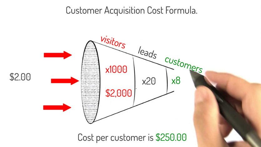
The cost to acquire a new customer becomes a fortune when only a small amount of traffic is converting.
Even worse, businesses have no idea if their marketing is working because they are not tracking their website conversion rate.
Also, you may have a decent amount of people coming to your website, however, they are not converting once they get there.
If your website has been designed around conversions, it may be because the people coming to your website are not aligned with your product or service offering.
As an example, if you only sell shoes, and the marketing messages you are using is saying that you only sell hats, you’ll probably have a pretty terrible website conversion rate.
That was an oversimplified example, but the same rule applies for all businesses.
How do you know if you have a traffic problem or a product/service alignment problem?
By measuring it!
There are many software solutions that can help you measure your traffic and website conversion rate.
We recommend using Google Analytics to do this as it is powerful and free to use.
If you don’t have Google Analytics configured on your website, check out my article here.
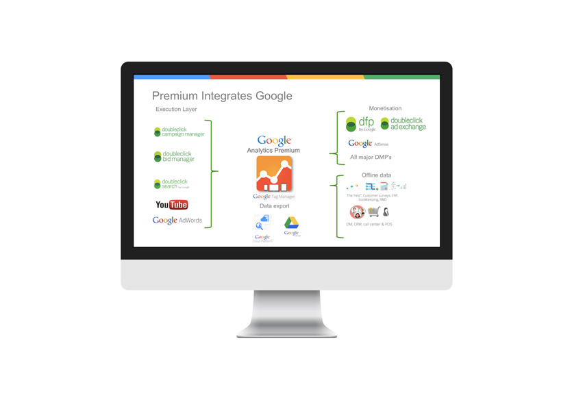
From the Google Analytics home screen, you’ll be able to get a read on the number of users, sessions and page views from the last 30 days.
What’s more important to learn is where and how those users are coming to your website.
The channels view under the acquisitions menu will tell you where your site users are coming from.
From here, you drill down into any one of those channels to get a better understanding of what keywords & actions your users are taking to get to your website.
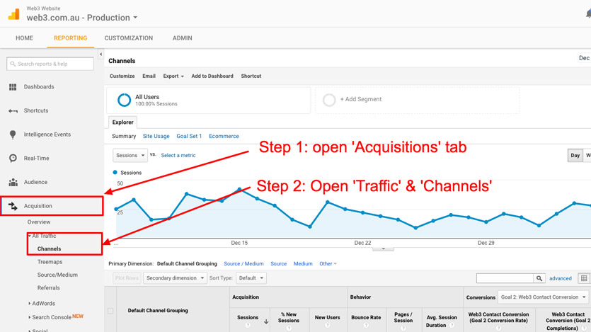
You’ll be able to understand pretty quickly if the keywords and actions your users are taking to get to your website are actually aligned with the messaging that you use to explain your product and service offering.
Measuring your website conversion rate
Okay, so your WordPress website is generating a small bit of traffic (over 1000 sessions per month) and the traffic is aligned with your product/service offering.
But if that traffic is not being converted to leads and sales, the problem must be the website, right?
Not quite so fast.
There are many factors beyond your website that influence conversions – timing, market conditions, economic cycles, industry trends…the list goes on.
The only true way in understanding if your website is at fault is by having a proper framework in place to measure your website conversion rate.
Fortunately, this can be done easily and for free in Google Analytics goal tracking feature.
How to set up Goal Tracking in Google Analytics
1.Map out the conversion actions your users can complete on your website. For example, a local consulting website would be something along the lines of:
a) enquiry via the contact form.
b) call using the phone number on the website.
Note: you can track the amount of phone calls generated from your website using a call tracking system like CallTrackingMetrics. The software bolts in together with your Google Analytics account. There’s even a useful WordPress plugin that feeds the amount of calls generated from your website to your WordPress website dashboard.
2. The easiest and most reliable way to track your website conversion rate is to have your visitors redirect to a thank you page after they’ve completed a conversion action.
For example, once someone fills out the contact form on your website and clicks the submit button, they are redirected to www.yourdomain.com/thanks. This page would contain a brief thank you message confirming that their message has been sent successfully.
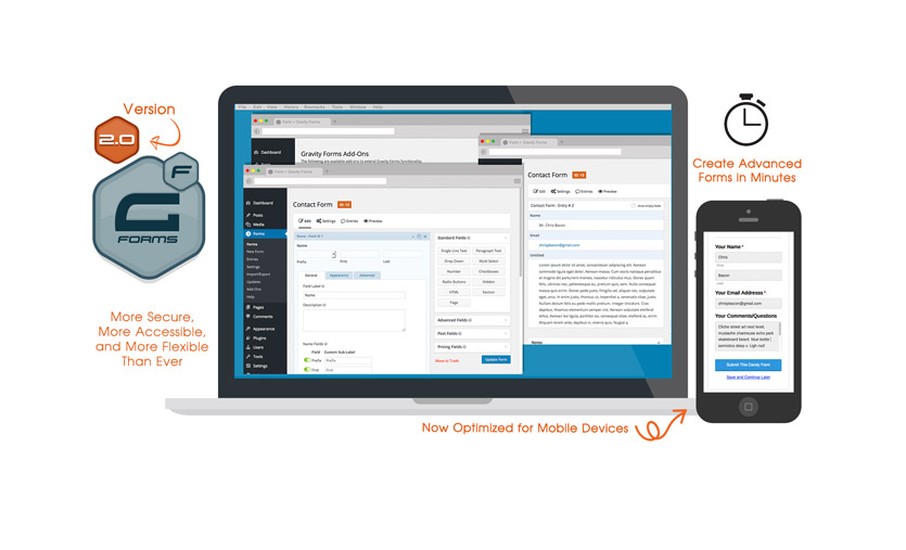
A solid WordPress form system like GravityForms allows you to redirect your users after submitting a form in a couple of steps as described in this article here.
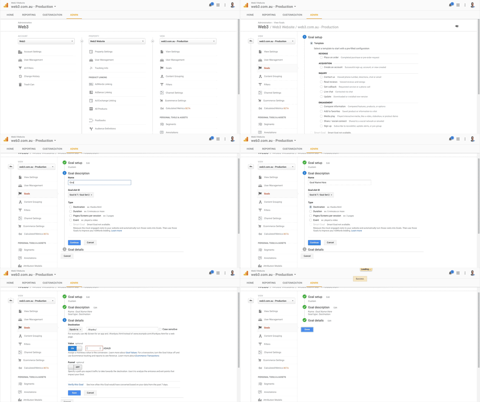
3. With your conversion goals mapped out with the right tools & software in place, it’s time to build them into Goal Tracking. Open up your Google Analytics account, click the ‘Admin’ tab at the top, and make sure your website is selected in the View box.
4. Click on the ‘Goals’ link under the view box, and click the ‘New Goal’ button to set up your first goal.
5. Select ‘Custom’ from the Goal Setup screen
6. Give the goal name something relevant and descriptive e.g ‘Web3 Contact Form Enquiry’. Set the type as ‘Destination’ and click next.
7. From the Goal Details screen, select ‘Equals to’ from the drop-down box, and enter the web page URL e.g /thank-you/. Be careful not to enter www.yourdomain.com.au/thank-you/ as this won’t work.
If you know what your average cost per lead amount is, enter it in the value box. That way, you can use this metric to better understand how much value your website is delivering each day. You can use the funnel feature to track multi-step forms and conversion processes such as shopping carts for e-commerce stores.
8. Click the verify goal link to check if everything works, then click save. Repeat this process for each conversion goal that you’d like to track on your website, such as email subscribers, downloads, purchases etc.
It’s super critical that we have a good website conversion rate measurement framework in place before we start working on the website. That way, we can track and measure the results that our changes bring in bettering your WordPress website’s ability to convert before we throw paid traffic at it.
If you are interested in learning more about Google Analytic’s Goal Tracking, I recommend you check out this article, and have a go at Google’s Analytics Academy.
Great design, user-interface & user-experience
If there’s only one thing to get right with your WordPress website, it would be to ensure the design is world-class. Whether you appreciate good design or not, design matters.
In fact, design matters a lot. Given 15 minutes, two-thirds of users would rather consume content on something beautifully designed than something plain. Additionally, 38% of user will stop engaging with a website if it is unattractive.
Don’t let poor design torpedo your chances of building a relationship with your audience before you’re even given a chance. That’s why investing in good design is so important.
With that said, here’s some actionable advice on how to better your WordPress website’s design, UI & UX to increase conversions
1. Have a clear pathway to conversion.
Your website’s goal should be to first capture the attention and engage your visitors, followed by getting them to the point of conversion as quickly as possible.

With that said, it’s important that your page layouts and navigation make it as easy as possible for your user to achieve this. Having your contact page buried beneath three layers of navigation makes it very difficult for your users to get to the point of conversion quickly.
Instead, make the pathway to conversion so simple and so easy that a three-year-old could get there within seconds.
2. Make sure the next step is obvious.
What is the next step your users need to take after they’ve visited your website? Is it to enquire? Maybe to book in a call? Or is it to make a purchase?
Get clarity on what that next step needs to be, and make sure every public page on your website is funnelling the user through to taking that next step with you. If your next step is to get your user to call or submit a form enquiry, make sure that you have a button or a link on your homepage, about page etc that will take them there.
Even better, have the contact form and phone number on each page so your visitors don’t have to go anywhere to take the next step.
3. One conversion action per page.
Having too many calls to action and next step buttons all in the same place kills your website’s ability to convert. It’s also ugly and a terrible user experience (see step one – the pathway to conversion needs to be clear and obvious!)
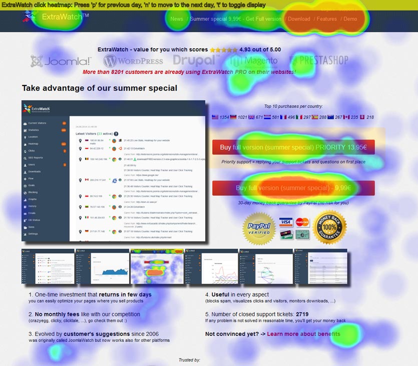
Instead, focus each page on your website around completing one conversion goal as opposed to telling your users to do a hundred things at once.
4. Clear and easy to find contact information.
Hiding away your phone number, contact page and/or buy now button is a good way to frustrate your users. Instead, try and place these key information pieces in an area that they can be instantly accessed from, such as your website header.
5. Make sure your website works well on mobile
It’s no longer surprising to see over 50% of all website traffic coming from mobile devices. In all other cases, traffic from mobile rarely dips below 25% of all traffic coming to the website
Put simply, if your website is not optimised to work well on mobile, it’s going to be near impossible to convert those mobile viewers into new customers.
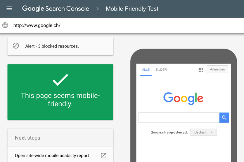
Google advocates the use of responsive design for websites to be considered mobile friendly. That is, your website’s layout responds to the screen size it is being viewed on, giving the best user experience for each device.
If your WordPress website is not responsive, there are plugins that you can use to generate a mobile-friendly version of it. I’m personally not a fan of these plugins as they create a disjointed user experience between the mobile version of your website and the non-mobile version.
The best way to make your WordPress website mobile friendly is to build it from the ground-up to be mobile friendly & responsive. If over half of your website’s traffic comes from mobile devices, you should consider taking a mobile-first approach to the development of your new website.
Even if only a small percentage of your existing traffic comes from mobile viewers, investing in a responsive mobile-friendly website is a no-brainer if you are wanting to maximise your website’s ability to convert traffic from all mediums.
6. Consider bringing your opt-ins above the fold
Part of creating a well-designed and beautiful user experience that drives conversions is making it super easy for your users to opt-in to whatever it is you’re selling.
Having your opt-in forms buried deep within your website’s navigation structure with no clear pathway to get there will kill your website conversion rate. Placing your opt-in forms at the very bottom of a long page can also lessen your website conversion rate.
Both scenarios may cause your audience to leave your web page, or get distracted by something else before they can actually get to the point of conversion.
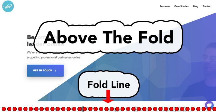
Put simply, you want to design your website in a way that it creates as little resistance and requires little work by the user for them to opt-in. Removing the need to scroll down a page to opt-in can help boost your website’s ability to work.
I’m not saying that every website should have all of their opt-ins above the fold.
At the very least in our experience, bringing opt-ins above the fold have resulted in a better website conversion rate. However, this may work for your website. There are some cases where below the fold opt-ins work better than above the fold opt-ins.
The right way to know if moving your opt-ins above the fold will result in an increase in your website conversion rate is to test and measure.
Specifically, A/B testing your page with the below the fold opt-in versus the exact same page but with the opt-in above the fold and seeing which version results in the better website conversion rate. Tools like Optimizely can make the A/B testing process relatively straightforward and easy.
For more tips on website conversion rate optimisation, check out my earlier post: How to create an engaging responsive website experience that drives conversions.
Improving speed & reliability
Website design is a subjective matter, particularly around what type of design is best for boosting your WordPress website’s ability to convert.
However, the one area that is completely black & white around increasing your website conversion rate is your WordPress website’s speed and reliability. There are so many ways to improve your WordPress speed.
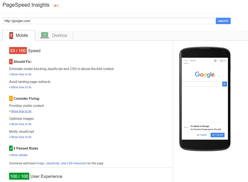
Put simply, if your WordPress website is slow, you are losing conversions.
If your WordPress website doesn’t even load in the first place, you’ve got absolutely zero chance to capture conversions.
Website speed and reliability is crucial if you want to see an improvement to your website conversion rate. Here are a few specific areas you should look into if you want to better the above.
1. High-Performance WordPress Hosting
It wouldn’t make much sense to buy a Ferrari only to park it on the street at night. The same goes for your WordPress website. If you’ve invested a tonne of time and resources on creating the perfect site, it makes no sense to park it on cheap and shoddy website hosting.
In fact, one of the top reasons why WordPress websites perform badly and are unreliable is due to poor quality website hosting.

If you want a super-reliable, secure and lightning fast WordPress website without rebuilding the whole thing, invest in quality dedicated WordPress website hosting.
We previously ran our entire WordPress website network through WP Engine. However, we have recently established our own dedicated WordPress hosting solution with servers located here in Brisbane.
This allows our Australian-based websites to load faster, as WP Engine’s closest data centre is in Tokyo, Japan. Put simply, the closer your website server is to your audience, the faster it will load in most cases.
2. Optimising your images and media
With your WordPress website set-up on quality hosting, the next lowest-hanging fruit to go after is your site’s images and media. Optimising your images and media for performance can result in a huge performance increase, particularly if your website has lots of images and media.
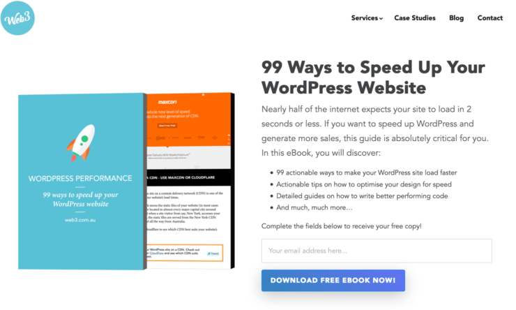
We’ve written in depth about website media optimisation in our free, 99 Ways to Speed Up Your WordPress Website ebook.
If you’re looking for some immediate wins, here’s the top three things I recommend you do:
a) Make sure your images are not bigger than they need to be
Resize your images so they fit the width of the container that they are sitting in.
For example, if you’re loading an image straight out of your DSLR in your latest blog post, the images is probably ten times larger than it actually needs to be.
The fastest way to know how large your images need to be is to right click on the image from your website browser, and select the ‘Inspect Element’ option. From here, you can either click on the ‘Computed’ or ‘Layout’ option (depending on the browser) which will give you the exact pixel dimensions that your images are being displayed on your web page.
With these dimensions noted down, open up the image in any good image editing tool such as Photoshop, and resize/crop your image to match the web browser display size.
b) Reduce image quality to save filesize
With your images sized correctly, bring them into Photoshop and use the ‘Save for web’ file option to reduce the file size by reducing the image quality percentage. Most image’s quality can be reduced to 30% from 100% without any visually noticeable loss in image quality, which results in huge savings in file size.
The smaller the image file size, the faster your website will load. Just be careful not to reduce the quality of your images too greatly to the point where you can visually see the reduction in visual quality.
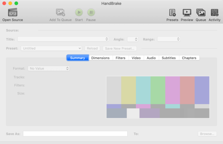
The same approach goes for videos. We prefer to use HandBrake for video-specific compression.
c) Remove junk data from image files
You can squeeze your image file size down even further by removing unnecessary metadata such as geotags from your image files. Tools like PNGGauntlet (PC Only), ImageOptin (Mac Only) and ImageAlpha (Mac Only) can help you to achieve this. This can also be done directly from your WordPress website by using plugins like EWWW Image Optimizer.
3. Compress and trim the fat
Having your WordPress website on quality dedicated WordPress hosting along with optimising your media will net the biggest performance gains.
Getting your WordPress installation compressed and combined can also result in significant performance and reliability gains. Here are two focus areas to further boost your WordPress website’s performance and reliability.
a) Compress your WordPress theme code
Just like reducing the filesize of your website images can net huge performance gains, the same can be done for your website code files.
The best way to do this is making sure your WordPress website is coded by a developer who practices the principles of writing high-performance code.
If rebuilding your WordPress website is not on your roadmap, you can install the W3 Total Cache plugin which will compress, minify and cache your existing theme CSS and JavaScript files, boosting performance.
b) Remove unused and non-essential plugins
A common reason why WordPress website stop working or break is due to plugin conflicts.
Removing the number of plugins in your WordPress website will reduce this issue from happening. It can also help to improve your website’s performance.
If you’ve been running a WordPress website for quite some time, you’ll probably notice a bunch of plugins that are no longer being used. Deactivate and delete the plugins that are not being used, and make it a routine to do so every so often.
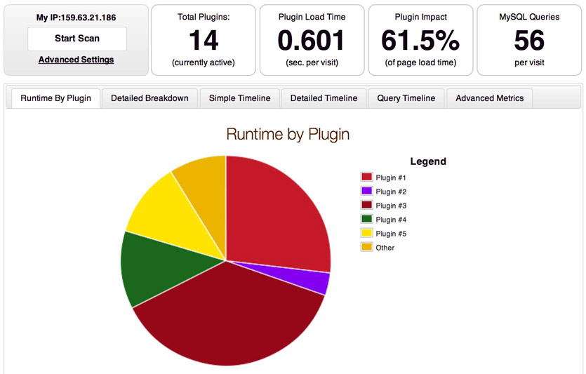
You can also use the P3 (Plugin Performance Profiler) to get an idea on which plugins are slowing your WordPress website down.
Demonstrating proof & credibility
Having a beautiful WordPress website designed to convert that is fast and reliable will give you the foundations you need to increase your website conversion rate.
However, your website conversion rate can flatline if your website’s copy and content fails to position your business as a credible and trustworthy authority in your space.
Gaining your audience’s trust on your website is critical if you want to increase your website conversion rate. The following tips assume that you are indeed a credible and trustworthy business operator with a great product or service.
If your product or service sucks, then you need to fix that first. No amount of marketing and sales tactics will fix a crappy product.
With all that said and done, here are seven things you can do on your WordPress site to better communicate trust and credibility to your viewers.
1. Case studies
Real-life results and facts speak the loudest to the credibility and value that your product or service delivers. Client or customer case studies are one of the very best ways to establish the credibility and value of what you do with your audience.
A case study should not look or read like a testimonial. Instead, a case study should tell a story about how your product and service was able to solve a problem and bring benefits to a select client.
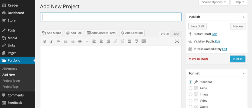
Great case studies typically outline the problem that was needing to the solved, the solution to the problem (i.e your service or product offering), and what results in your solution delivered to the client.
Your case studies should be made accessible to your viewers by either being placed on your website’s homepage and/or your product/service pages. For established business that have many case studies, you should consider having a dedicated case study section on your website that is easily accessed from your website’s navigation.
2. Testimonials
Testimonials straight from your client’s mouth are golden and should be made immediately on your WordPress website. At the very least, your testimonials should also be listed with the client’s full name, location (Typically for B2C operations) or corporate position (for B2B) and a headshot of the person giving the testimonial.
This will help to make the testimonial more personable, relatable and genuine to the viewer.
Having a testimonial that says nothing more about what your website page is already saying isn’t very valuable or useful for your viewers. Instead, focus on selecting testimonials that highlight the key benefits and differentiators that your product and service provides.
3. Client logos
Having done business with well known and respected brands is a great credential to your business’s credibility. The client logo bar is one of the most fundamental layout elements that can help elevate your brand above your competitors.
From a design point of view, it’s a good idea to grayscale the logos of your clients. That way, your viewers will be focused on your brand, with your client’s brands working to support the credibility of your brand.
4. Security logos
If you’re processing payments on your website, showing payment gateway security logos can help reduce the fear and resistance to making online payments from your viewers.

By default, your WordPress website should be security encrypted with HTTPS and you should be using a secure payment facilitator like Stripe or PayPal to process your payments.
As with making your client logos apparent on your website, you should make your security & payment processing logos apparent too to reduce resistance and increase your credibility.
In terms of positioning, you should place your security logos around the point of asking for payment e.g your payment processing form.
5. Great content
Having great, personable, readable, benefit and outcome driven content for your WordPress website will go a long way to increasing trust and credibility with your audience.
If your website content only talks about yourself and speaks nothing towards the wants and needs of your audience, you’re going to have a hard time convincing your audience that you indeed know how to solve their problems.
Instead, put yourself in your ideal customer’s shoes, and craft your content around the key benefits and outcomes that your customers want to gain from working with you or using your product.
Great content in an excellently designed single column layout can boost conversions, in some cases by over 600%.
Finally, make an effort to make your content simple and easy to understand. Use correct title casing for your headings. Maintain short sentences and simple, non-technical words.
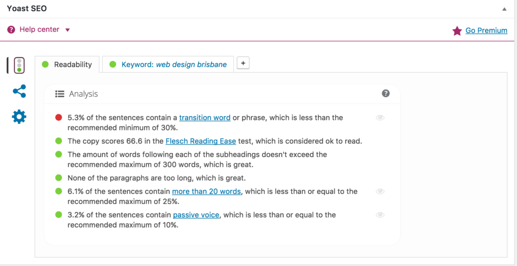
Yoast SEO, one of the leading WordPress plugins for SEO, has recently released a content improvement checker. The plugin will automatically highlight sentences in your WordPress page copy that are too wordy along with grammar than can be improved so your writing is more readable and engaging.
6. Awards & recognition
If your business has received industry awards & recognition, you should make this apparent on your website. Business awards can help legitimise your business, and add extra layers and proof and credibility to your organisation.
Business awards can help legitimise your business, and add extra layers and proof and credibility to your organisation.
7. Reviews
Product or service reviews are another excellent way to demonstrate proof that your products and services actually work.

A recent survey by Shopify found that 70% of customers consult reviews or ratings before making a final purchasing decision. Interestingly, 63% of consumers are more likely to purchase from a site if it has product ratings and reviews.
Additionally, reviews can be an excellent way to stimulate user-generated content on your website, which can help to benefit your site well in the search engines.
So there it is, our essential guide to increasing your WordPress website conversion rate.
Do you know of anyone struggling to convert customers on their WP site? Feel free to share this guide with them.
What’s the number one thing you’ve done on your WordPress website that has led to a better website conversion rate?
Share that with me in the comments section below, and let’s start a conversation!
BONUS CONTENT: Checkout my slidedeck and event livestream video on this topic below:

