On Thursday evening at The Edge, Brisbane I presented on how to create an engaging mobile responsive WordPress website and web experience that drives more sales, leads & enquires from your website.
I have uploaded my presentation slides with embedded videos below for your viewing benefit. If you enjoyed the presentation, please Tweet or Facebook share this post so those who missed it can find it easier.
Missed the event? Fret not, I also delivered this presentation again at the Brisbane UX Meetup. I hope I got to see you there.
Here is the main information from the presentation:
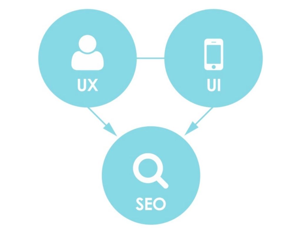
To create an engaging mobile web experience that drives conversions, you need to focus on user experience and user interface. This in turn results in better SEO for your website. Google factors the experience of people using your site as one of the factors to rank your website in their search results.
Some of the user experience factors that Google measures is how the user interacts with your site, whether they stay on the site for a long time or not and whether they go to further pages on your site.
If you have a poor user experience then you will more than likely have poor SEO as well.
I presented at Melbourne WordCamp on all things to do with building a mobile first website designed and developed in WordPress. If you have a WordPress website then be sure to check that out to see if your website is up to scratch on mobile.
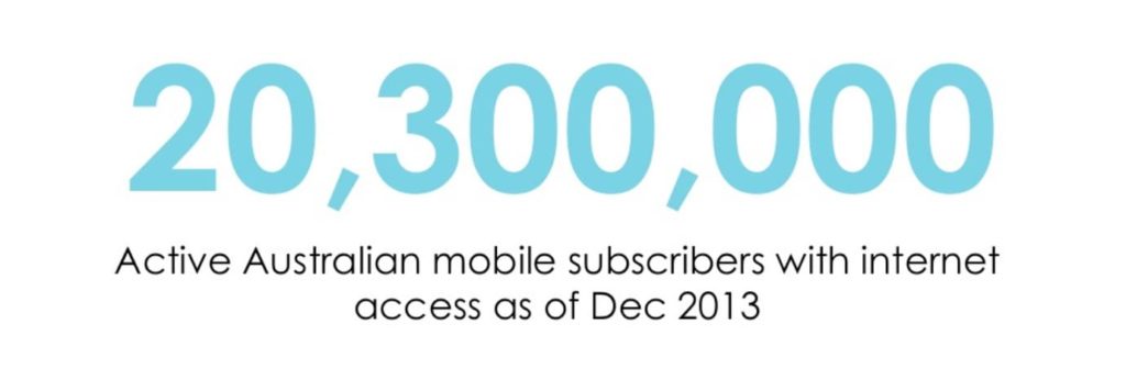
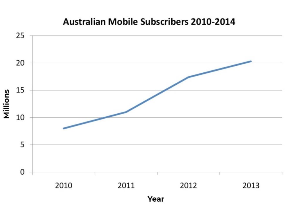
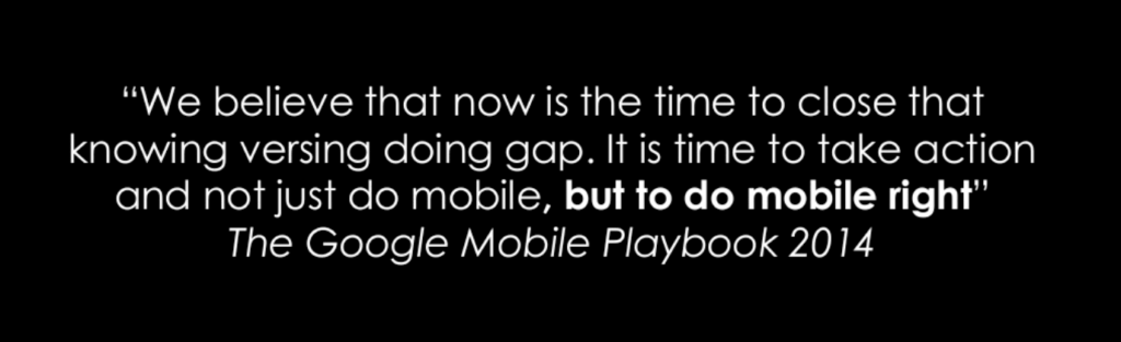
As of December 2013, there were 20.3 million active mobile subscriptions throughout Australia. That means that the majority of the population have access to mobile internet. They are likely using a smartphone to access your website.
Of the millions of people that do use internet on their mobile, 90% of these people search for information about their local area. That means that if your business deals with people in your local area, then there are millions of people trying to find you online.
If you sell a product rather than a local service then 78% of these people will research for products via their mobile device before they buy a product they are looking for.
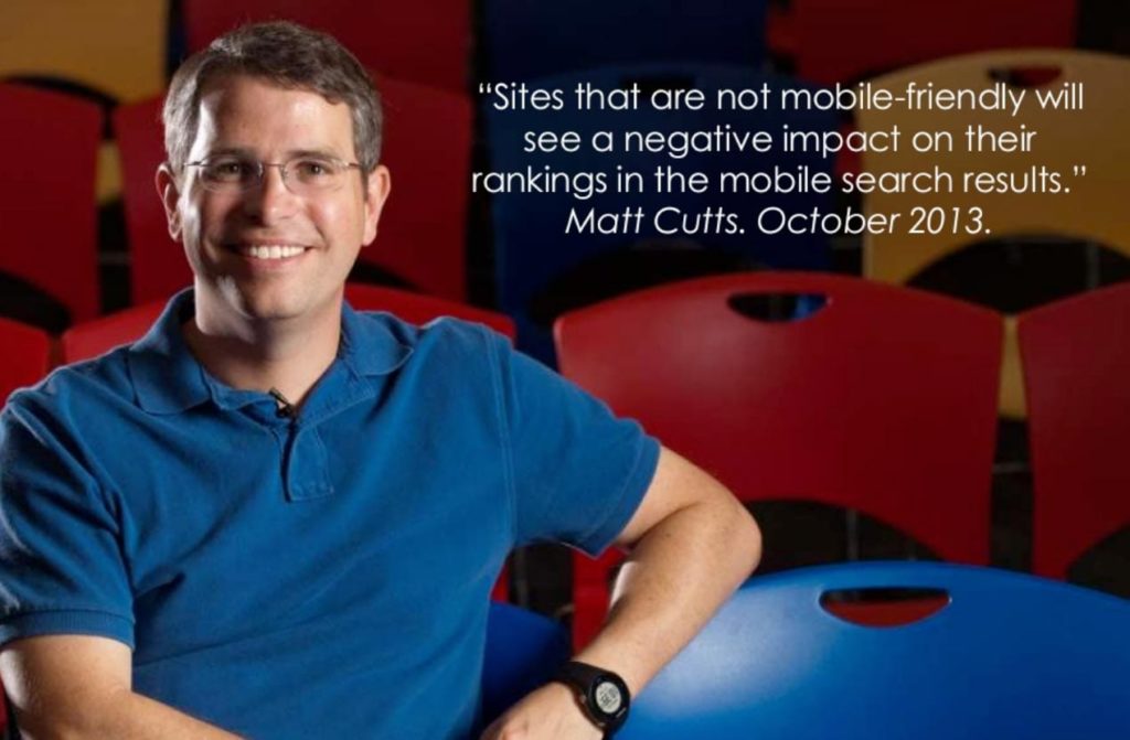
Google will develop for mobile devices first and all other devices secondarily.
Eric Schmidt. Mobile World Congress 2010
Apple is a mobile devices company
Steve Jobs. iPad Launch Keynote 2010.
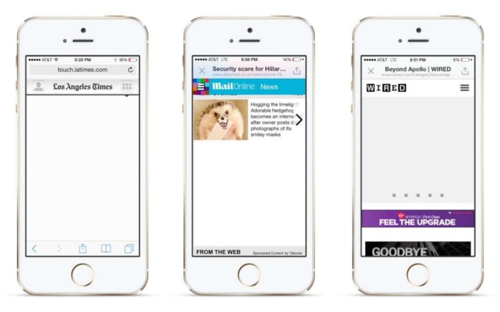
The mobile web user experience has always been quite terrible. Website owners have always focused on desktop because that is where majority of users are coming from.
However in the past couple of years and especially around the time of the first couple of iPhone and iPad launches, mobile really came to the forefront.
Here are a couple mobile optimised websites that we recently built.
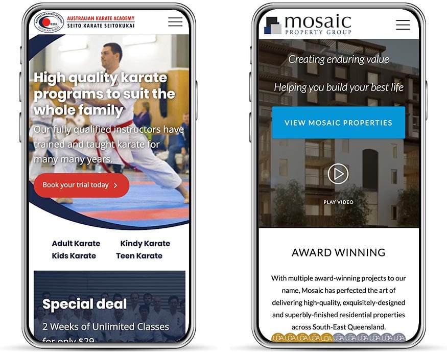
Notice how the website is extremely simple and easy to navigate for small screen sizes. It all comes down to adapting for the intent of the user on the device they are using.
You could have the greatest website in the world, but if no one can find it, then it is absolutely pointless.
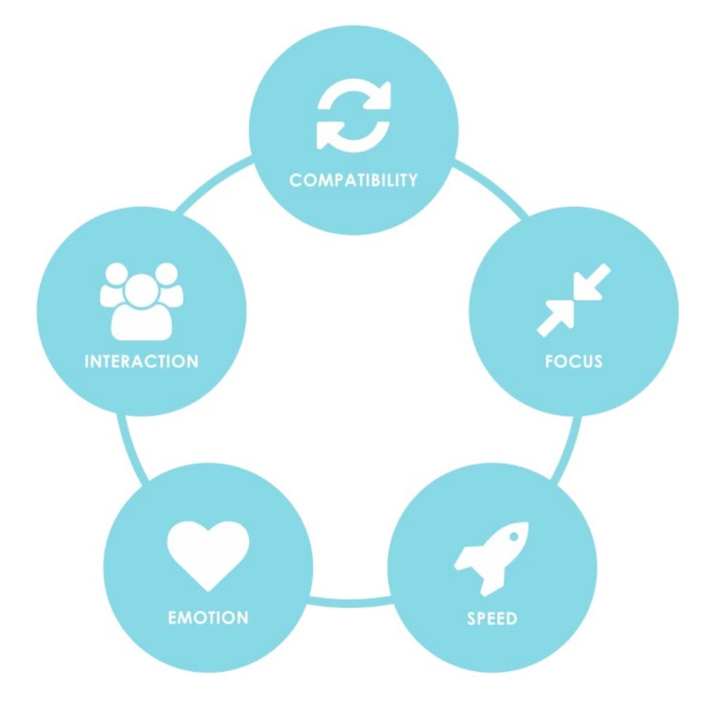
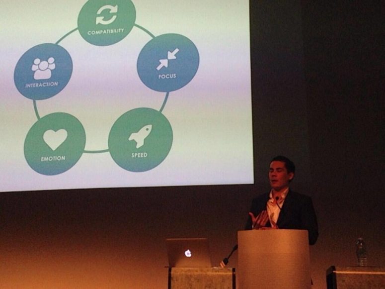
To create an engaging mobile web experience that drives conversions, there needs to be 5 core pillars at play.
Compatibility – The site needs to be compatible across all screen sizes. That means that it is built mobile responsively.
A lot of old sites used outdated technology such as Flash. Flash provided great multimedia capabilities but very quickly became outdated across the web and especially on mobile devices that simply refuse to display it.
Focus – There should be no clutter on the page and the key conversion points should easily be the top priority focus. A website should be built from the ground up to have a clear primary objective.
It wasn’t since Caffeine in 2010 that the Google Algorithm was updated so deeply.
Amit Singhal – Senior VP & engineer at Google. Referring to Mobilegeddon
The website content or the parts that make up the page should all be structured around the primary objective.
Speed – The website needs to load quickly. Mobile internet connections can be very unreliable especially outside city centres.
Websites in general should be small in file size and quick to load. This is definitely an SEO factor that Google has stated in the past will help with SEO. Websites are able to load only the parts at the top of the page.
The rest should be loaded when the user scrolls to that part of the page. This is called lazy loading.
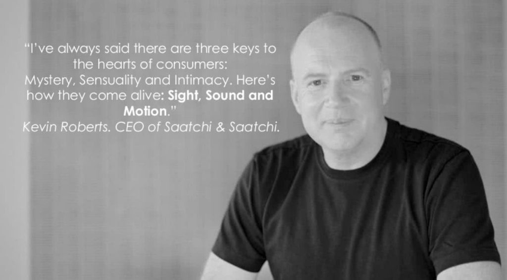
Emotion – Your website needs to be engaging. People buy on emotion and then justify the decision with logic. If the site is boring and focused on the product/services specifications then people will be less likely to buy from you.
Try working on the emotions and outcomes that your product or service will achieve rather than just the features. Try to avoid just having a wall of text. If you can add imagery and photos then it will be far more engaging for the user.
Take a look at our homepage. We like to use lots of video and imagery to help engage customers with our services.
After adding video to our homepage, the average visit duration increased by 158% and the overall bounce rate reduced by 19%.
You need video!
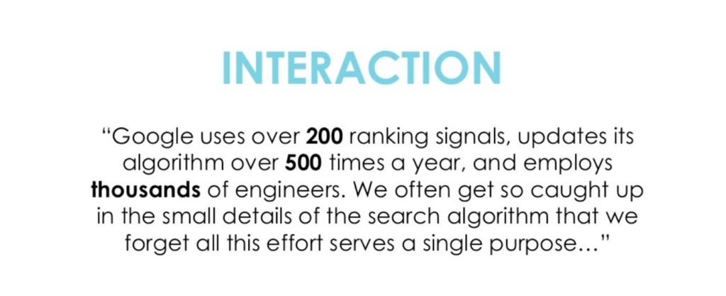
Interaction – Interaction is all about removing the barriers from the user being able to convert on your site.
People like to connect with brands. Build a brand that people will like based on emotion and then give them the opportunity to interact. This may be through contact forms, blog comments or a forum to name a few.
SATISFY THE USER!
There are many barriers that you can put in place to have a negative effect on your users. Here are the top five to avoid:
- Splash/welcome pages. Present the most important information to your users immediately. The more they have to search or wait to see what they are after, the more likely they will leave your site in search of another.
- Popups. People dont like to be interrupted. When you have an auto popup reveal on your page to capture lead details, this creates a barrier for users and they may exit as a result. A better option is to have the popup fire when their mouse leaves the window. That way you can catch them before they leave your site.
- Complicated navigation. Your website should be very easy to navigate and the most important information easily accessable.
- Hiding contact details. Dont make it hard for your users to be able to get in touch with you. A good idea is to have at the very least either a phone number or a contact button in your main navigation.
- Tap to call phone numbers. For users on mobile, it is important to have the ability for the user to tap the mobile and be able to call you. This is called tap-to-call. It is a special type of link that tells the mobile phone to call the number.
Top 5 Key Action Items
- Get rid of old outdated technology that doesn’t work for your users. That includes flash and mobile sub-sites. Utilise responsive design instead.
- Focus your website around a primary objective. Keep it simple and avoid confusing the user away from the core objective of your page.
- Load only the content that is necessary. If you have a long page, consider lazy-loading the content that is displayed further down the site.
- Use video and imagery throughout your site. Your website is meant to be interactive and evoking emotion to get the user to buy. Imagery is one of the best ways to achieve that.
- Remove all barriers. Remove all the junk on the page that is not necessary to achieving the goal of building an awesome conversion focused website for all devices not just mobile.
It was a pleasure to present to a passionate crowd, and judging from the feedback, the tips and tricks that I shared were well received by the audience. It is also great to see that the Brisbane Web Design Meetup group is well underway for 2014.
Also, a big thank you to all of those who stuck around from the post-event networking drinks at the Era bar. It was great to meet some new and see existing faces at the Brisbane Web Design meetup. Myself and the rest of the team at Web3 cannot wait for next months meetup!
 Trusted by 450+ great brands
 Multi Award winning web agency
 15+ year track record of real results