
More and more business is being conducted on the internet these days, and getting online is easier than ever thanks to mobile technology like smartphones.
It used to be that accessing the internet from your mobile device was a novelty, but today it’s commonplace. In 2015, 85% of young adults in America were smartphone users, and a staggering 97% of people in this group used their smartphone to access the internet on a regular basis.
Clearly, the generation poised to inherit the world relies heavily on mobile technology for getting information and conducting business.
The implication of such a fact is obvious: companies who hope to remain competitive in the future will have to make themselves as mobile friendly as possible.
Responsive design
Designing responsive websites is quite easy provided you know what you are doing.
Quite often we speak to fantastic designers who work solely with print based applications and then try to design for the web. Because they are different, they end up running into issues. Designing for the web is very similar to print however some parts simply must be taken into consideration.
These considerations are especially important if you are designing for the mobile web where multiple screen sizes come in to play.
I am going to demonstrate some best practices to ensure your next design will work great on the web.
Firstly, we should clarify what responsive web design is. Here is a quick demonstration video:
The biggest thing to keep in mind is that when you design a website for mobile and desktop users, you are actually designing for hundreds of different screen sizes.
Gone are the days where you can build one layout at a fixed size and have it work across every visitors devices. Your design needs to scale and adapt to be usable on all devices. What might be an easy website to use on a large computer screen might be almost impossible to use on a mobile phone and Vice versa.
To overcome this challenge, it is important to ensure that your design has been built in a way that will adapt to different screen sizes. This is where responsive web design comes in. Using a responsive grid system will surely help.
Grid systems
All professionally built websites will utilise a grid system in one way or another to ensure all objects are in-line and consistent with each other. Grid systems help to enhance the visual experience for visitors and also helps them follow the consistency of the site as a whole.

Not only are grid systems good for usability sake, they help us website developers when building the layout so that it is well thought-out and consistent.
There is a lot of theory behind grid systems. Developing grids is all about numbers, proportions, and other equally unsavoury things.
To keep it simple, just remember that a grid is made up of consistently sized squares or rectangles across the page. These columns will span down the page in different rows. If your grid system is using a responsive approach, it will rearrange these columns to fit the screen size.
For example, If your page is using 4 columns on a desktop, it may push the next 2 columns down underneath to accommodate more room horizontally.

When it comes to designing, often it is thought to be about freedom and expression. The idea of using a calculator during design is not the sexiest of ideas. As a result, we often tend to drop the subject.
Grids take work and planning and it is often thought that it would put a halt to the creative process. This is simply not the case and all successful websites will use a grid in one way or another.
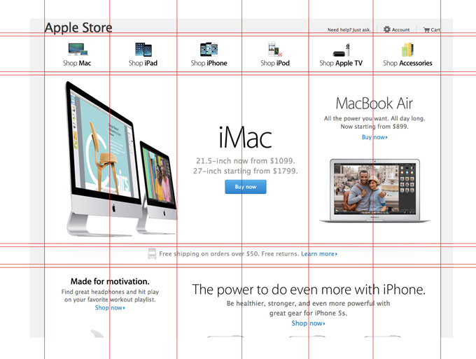
Here is what a general website usually looks like in its most basic form laid out in a grid:
Notice that it is using a very strong, well thought out grid system. This sort of planing is what will ensure your website works across all of its pages.
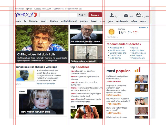
Here is 2 of the most visited websites in Australia that use grid systems:
To start designing websites in a grid you should use representative examples of your text, along with some graphics, scans, or other illustrative material, and experiment with various arrangements of the elements on the page.
Be sure to decide how many columns the page will have. Once you have created the layout, ask yourself “do the elements on this page look consistent with each other”. You will then want to ask “Will this general layout be able to be used on each additional page I want to include on my site?”
You want to aim to have consistent and logical layouts across your site to ensure a good usability flow for visitors. The aim after all is to direct users to the content that you want them to either read or take action upon.
Once the general layout has been decided upon, you should be able to put your text and graphics into the page without having to stop and rethink the basic design approach when creating a new page.
Well designed grid systems can make your designs not only more beautiful and legible, but more usable.
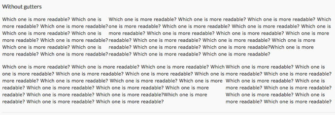
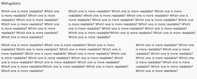
Gutters
Gutters are the gaps or “padding” in between each column. They are there so both text and images from different columns don’t run into each other and have room to breathe.
Make sure your columns have gutters in-between them. Which image below is easier to read?
Mobile Web Best Practices
Use a grid system. Add spacing in-between the columns and make sure your design is going to be usable across all screen layouts.
Designing a website layout:
- Divide page into even horizontal columns
- Add spacing between columns
- Start designing and stick to putting content in the columns.
I hope that helps when designing your next website layout. Are there any additional requirements you follow when designing your website?
Yes sure there are dozens of factors. Let us know your favourite in the comments below.
What does getting mobile-friendly mean today?
At this point, one of the biggest steps a company can take is to optimise its website for mobile use (if it hasn’t already done so). If you’re the designer for such a company, this could mean several things: you might want to tweak your existing mobile site, or construct a brand new mobile-friendly page from scratch.
Since smartphones are evolving extremely quickly, a page from several years ago may no longer be sufficient to keep up with new tools and features that users will expect to be supported.

Here’s an example: since 4K resolution displays and 5G network capabilities are set to become the new normal, mobile devices are going to be able to access a lot more visual content than they were able to in previous years.
This doesn’t mean that users will be accessing desktop pages with their smartphones, though, because studies show that the same people are drawn to different kinds of content depending on how they access the web.

Smartphone users have always been partial to content with plenty of images and short videos, so the fewer restrictions they face in terms of bandwidth and speed, the more you can expect this type of content to thrive.
What happens if I don’t optimise my site for mobile use?
There’s another huge reason that businesses need to have mobile-friendly websites, and that’s Google.
An algorithm update imposed major penalties on websites that didn’t match Google’s criteria for mobile-friendliness, causing a drop in rankings for almost half of all non-mobile friendly URLs.

At first, many people dismissed the consequences of “Mobilegeddon” (as it was called), but many quickly realised their mistake when the hard data arrived. The evidence didn’t lie: good mobile design helped businesses, while poor design (or none at all) proved to be detrimental.
With the number of people accessing websites from smartphones, the growing trend in mobile technology to embrace and enhance internet access, and the cost of not having an up-to-date mobile site, your question as a marketer shouldn’t be whether or not to have one.
Rather, you should be asking yourself how you can design the best mobile site possible. You’ll also want to keep an eye out for other articles and sources of information on new mobile trends as time goes by.
Keeping up with new technology means you’ll be the first to acquire the customers who use it.
How is your business adapting to the mobile world we live in today?
Leave a comment below and let’s start a discussion on all things mobile.
 Trusted by 450+ great brands
 Multi Award winning web agency
 15+ year track record of real results