With the ever-increasing amount of mobile devices and varying screen sizes, the issue of websites rendering poorly on mobile devices has never been more apparent.
The layout of a webpage that fits nicely on a large desktop computer will more than likely be extremely hard to use on a smartphone. This is because the website has not been optimised for the small screens of mobile devices.
Enter Responsive Web Design
This technique for designing websites is being touted as the way of the future. Responsive websites incorporate modern code in what makes up the files of the site. This code allows the website to dynamically change each page layout depending on the screen size that the website is being viewed on.
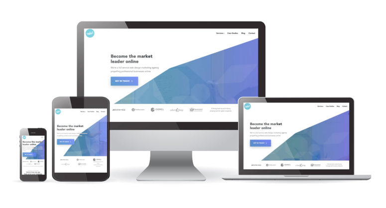
Have a look at the Web3 website on a mobile and a tablet device or resize your browser to see the technology in work.
Because mobile devices such as smartphones and tablets are rapidly growing in popularity each day as one of the foremost ways to access the internet, it is becoming increasingly clear that responsive web design is the future for building websites.
There are over 1.2 billion users accessing the internet on their mobiles. As a result, it is no longer acceptable to have one website size that fits all. Your website needs to be responsive.
What is Responsive Web Design
Responsive web design enables a website to adapt it’s layout to the size of the screen that the device is being accessed from.
Your website’s content will not only look good on any device, but it will be a lot easier for your users to read and interact with your site compared to other sites that are not responsive.
Responsive web design uses strict grid systems to ensure the content is uniform and when the size of a screen is smaller than the container of the site content it will automatically shrink down to fit. Images grow or shrink depending on the grid and text reflows depending on the grid container’s width.
The end result is each user, no matter if they are using a smartphone, tablet or desktop computer, will all have the same consistent experience on each device they use your website on.
Whether it be buying a product or contacting your business, if the user visits your responsive optimised site on different sizes devices, they will already be familiar with the layout and design each time they use your website on a different device.
If the user is already familiar with the layout of your site on a phone and they return to your site on a desktop, then chances are they will be able to take action quicker as they wont need to familiarise themselves again to the websites new design and layout.
Mobile’s Rapid Rise
People are increasingly reaching for their smartphones and tablets to access the web.
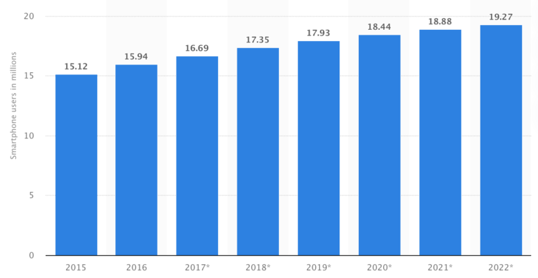
A recent study shows in 2013, 65% of all people in Australia have a mobile web equipped device such as a smartphone or a tablet. This is a rise from 37% in 2011 and 52% in 2012. That means that approximately 14,508,000 Australians have a mobile device that are ready to access your website. Of the approximate amount of 14.5 million Australians that have a smartphone or tablet, 90% of these owners use the internet on their device every day.
This number has and will continue to increase over time

With all the different devices that exist today it is not surprising that there are over 230 unique screen resolutions in 2013. This number of different screen sizes continue to grow so it is important that your website fits all of these devices to be able to have the largest reach to your users as possible.
With responsive web design, we are able to make your website layout fit to the size of your users screens.
Shoppers Are Going Mobile

With an increase in Australian mobile usage by over 28% in just 2 years, customers are accessing and buying products on websites with these devices more than ever. This number is continually rising and a great customer experience for mobile shoppers is going to be more crucial than ever in the years ahead.
It is expected that within 5 years time almost 80% of mobile users will make at least one purchase online using their mobile or tablet.
In 2013, it is expected that just under $40 Billion of online shopping revenue will come from customers using a mobile or tablet device. More so, this figure of $40 Billion is expected to almost triple within just five years.
On average, 21% of website traffic to leading e-commerce websites is coming from tablets and smartphones. This is a huge increase year over year, and has opened a new multi-billion dollar market for online store owners whose e-commerce stores are optimised for mobile devices.
Benefits of Responsive Web Design
The biggest benefits of responsive web design are:
- Consistent and optimised customer experiences across all devices by making the website interface universally accessible.
- Responsive websites are built around the latest CSS3/HTML5 web coding standards defined by the World Wide Web Consortium.
- Google prefers device-agnostic URL structures. This means that the URL of the page is the same on mobile devices as it is on tablets and desktop computers.
- Your content does not need to be repeated on separate mobile, tablet and desktop sites. It is manageable from the one location.
- You are essentially getting 3 sites in one (mobile, tablet and desktop) and allows you to reach your target market across these three primary web browsing enabled devices.
Is your website optimised for the future? If your site is not mobile and tablet optimised then you are potentially providing a very poor user experience for your non-desktop users.
If you own a website, have you viewed it on a mobile or tablet? Chances are you will be disappointed by what you see and your SEO efforts can be affected because of this.
At Web3 we specialise in responsive web design and spend countless hours ensuring our websites are highly optimised for desktop, tablet and mobile devices. We are ready to turn your website into a modern marketing machine.
Developing your website so that it is responsive is just one of the ways we can help you. We have already helped a large number of businesses gain excellent exposure online using responsive web design and can certainly help you too.
Send us a message or give us a call today if you would like your website optimised for mobile devices.
 Trusted by 450+ great brands
 Multi Award winning web agency
 15+ year track record of real results