Web design trends, as with fashion, change with the seasons. As consumer tastes evolve, what is considered fashionable in web design evolves too. Some of the top web design trends stay in vogue for many years. Others die out faster than the revival of parachute pants.
The top web design trends typically evolve in yearly cycles, with genre-defining trends every 5-8 years or so. The Web 1.0, Web 2.0, flat design/responsive design eras are the big three genre-defining top web design trends since the inception of websites.
With that said, everyone who is a designer or is considering redesigning their website in 2022 needs to know what are the design trends to look out for.
There’s nothing worse than forking out a decent amount of cash to have your website redesigned, only to see it look like something ‘from ten years ago’ produced. Here’s what I believe will be the top web design trends in 2022:
1. Content-first design
Content-first design isn’t something new for 2022. The content-first design trend became popular around the same time content marketing and responsive design became mainstream in the business world. In a nutshell, content-first design is all about crafting killer content first, then designing your website around that content.
To be more specific, websites are typically wireframe and designed first using Lorem Ipsum dummy or placeholder text while the content is produced. With content being one of the most important things to nail on your website (and consequently, where so many businesses fail at), it makes sense to craft your website’s design around your content.
That way, your message can be communicated in the most powerful and visually appealing way possible. The content first design approach is particularly important for news, information and research-style website, along with businesses who invest heavily into content marketing.
2. Creative use of geometric shapes
A trend that has come into force in 2016 is the creative use of geometric shapes in a website’s design. For decades, website users have become accustomed to a boxed, horizontal straight line and a vertical straight edge style of website viewing.

The use of geometric shapes to break up this ‘boxed’ feel can really make a website stand out from the crowd. I believe that the use of geometric shapes in conjunction with creative animation effects will be a defining trend to look out for in 2022.
3. Creative use of geometric lines
Since the first websites to go live on the internet were created in table layouts, lines and grids have characterised website design. During the late 2000’s there was a strong move away from grids to a more organic and unstructured layout of the web.
However, with the introduction of mobile web devices and the responses design revolution that took place in the early 2010’s, grids and lines have come back into fashion.
A relativity fresh take on grids and lines in web design is using them in an animated way to create an experience. Lines and grids combined together can create powerful design effects.
4. Geometric patterns
Patterns were commonplace on the internet during the Web 2.0 era. The flat-design trend saw an exodus of pattern use in website designs. With the advancement of SVG and CSS animation support in major browsers, patterns are starting to make a comeback.
By combining geometric shapes, typography and animation to create patterns, you can produce a striking design.
5. Creative page headers
One of the biggest trends to look out for in 2022 is the use of creative page header styles. Most of us are conditioned to seeing large background header images with a title and a button on top.
With the advancement of SVG animations, CSS & WebGL, Adobe Flash-like animated experiences can almost be replicated in the browser without all the negatives associated with Adobe Flash.
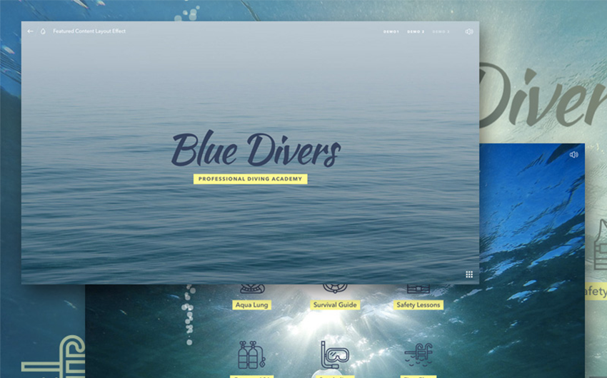
As it becomes more difficult to capture people’s attention when they enter your web pages, expect to see creative animated page headers appear more and more in 2022.
6. Two-tone gradient imagery
If I could pick one design trend that characterised 2016, it would be the return of gradients in web design.
Gradients were expelled from the web during the flat-design revolution, and for the right reasons (rainbow powerpoint slide backgrounds anyone?).
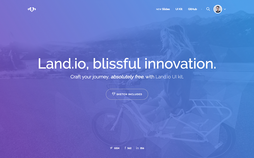
However, thanks to Apple, Instagram and even Pokemon Go’s heavy use of two-tone gradients in 2016, the gradient has come back into fashion. Expect to see the use of subtle gradients in combination with animated effects for extra impact in 2022.
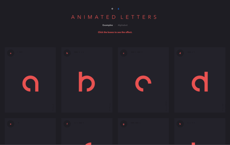
7. Increase use of animated elements
For decades, the internet has been characterised by static, non-moving content. However, the last couple of years has disrupted this status-quo with the increased use of video content.
By far, video content is the most engaging form of content on the internet. That’s why video content marketing is exploding and will continue to gain momentum in 2022.
What we have seen on the design front is a trickle down effect on the consumer’s preference for video. Websites that contain no animation or transition effects are quickly being considered boring and bland.
The use of video on a website is nothing new. However, creative uses of animated and transitional style effects will continue to grow and evolve in 2022.
8. Tasteful use of animated GIFs
Prior to HTML5 and the popularisation of video hosting platforms like YouTube, the only way you could get animated elements on a web page was with GIFs. Unfortunately, GIFs are characterised by huge file sizes and patchy quality. That, combined with dial-up internet speeds causes GIFs to be seen as the anti-christ of website design.
However, thanks to the flat design trend greatly reducing the file size requirements of GIFs, the once most hated image format on the internet is making a comeback. The best thing about using GIFs in website design is that animations remain consistent across all devices as auto-playing video containers are not supported on the major mobile browsers.
9. Minimal navigation links
Before Google updated its search algorithm to consider the quality of website content in its ability to rank, the way to get a site to the top of Google was to fill them up with content.
The content in question did not have to be good quality content, so the result was large bloated websites to layers-upon-layers of navigation.
With the responsive design revolution, multi-layered navigation structures begun to take a back seat to well-executed single service or product landing pages with concise, quality content.
Top-level navigation (that is, the navigation area typically at the top of a web page) are being reduced and simplified to no more than five, or sometimes three, page links. Content-heavy websites can still benefit from simple navigation structures through the use of mega-menu style navigation.
10. Augmented reality in websites
You can thank those pesky kids (and adults) for bringing augmented reality mainstream in 2016 with Pokemon Go. Snapchat has also helped popularise augmented reality with the use of snap filters.
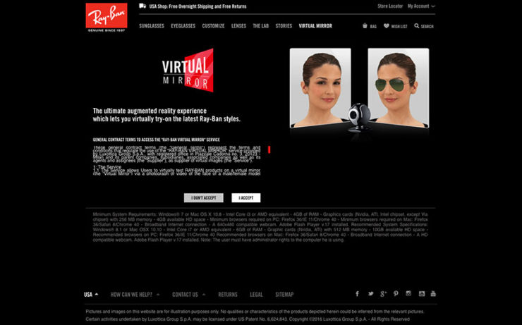
Interestingly, augmented reality has been used on the web in a few edge cases for quite some time. Websites like Ray Ban’s Virtual Mirror gives the user the ability to virtually try on different Ray Ban sunglasses by superimposing them onto your face via Webcam. Expect to see a few more edge cases of Augmented Reality on the web in 2022.
11. Virtual reality in websites
With video content consuming the internet, it makes it harder and harder to visually ‘wow’ someone on a website when everyone is doing the same thing.
Virtual reality devices are becoming cheaper, more sophisticated and more widespread each passing year. Although virtual reality from a website is still quite bleeding edge technology, my prediction is VR-enabled websites will be the next major design trend.
Realistically, we’re probably a few years off from it becoming more widespread, but expect to see more VR-ready websites in 2022.
12. Increased emphasis on micro-moments
Google’s Material Design language, which many see as the successor to flat design, is unpinned by something Google calls ‘micro-moments’.
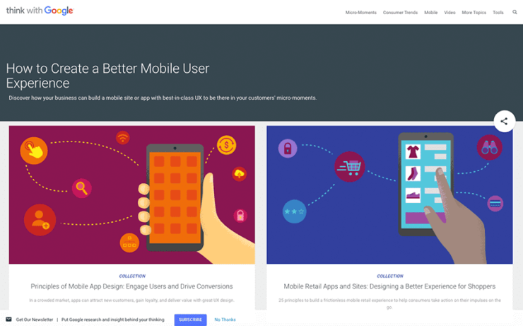
As the modern customer journey becomes increasingly layered and complex, good website design should be to optimise for micro-moments – creating small but memorable moments that delights the user.
A micro-moment can be as simple as having a fast loading website to the more sophisticated moments like tailoring a website’s content to match the geolocation and time zone of the visitor.
13. Conversion-centric design
Web design has evolved down two polarising lanes: the creative ‘wow’ factor designs and the functional, but often design lacking, conversion-focused designs.
As businesses become more savvy on the importance of having a website that not only looks good but does its job at converting more customers, websites designed for conversions in mind will continue to grow in 2022.
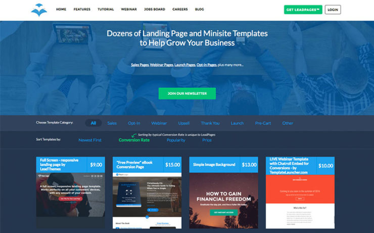
Websites that are conversion-centric typically include elements and sections that are commonly found on landing pages, such as calls to action, testimonials, case studies, how it works, meet the team and frequently asked questions. Purely creative websites will still have their place on the internet, but I believe they will take more of a side-seat to conversion-centric web designs.
14. Hand-drawn elements
Once reserved for spiritual readings and shamen-type websites, professionally hand-drawn elements are appearing on more and more sites across the web.
Similar to how the use of geometric shapes distorts the boxed feel of websites, organic hand-drawn elements can help break the mould of traditional website design.
For added flair, using hand-drawn elements in a layered or animated effect can create a powerful & unique user-experience.
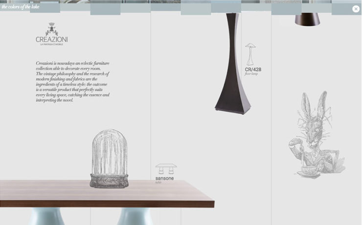
15. Move away from boxed to open layouts
Open layouts are certainly not a new trend in web design, however, the appearance of boxed websites is becoming less and less as the years’ progress.
Open layout websites typically work better when it comes to mobile resizing, as there are less bordering and bounding elements to deal with.
Naturally, as with all design trends, there will probably be a rebound back to boxed layouts in the future. However, I personally do not believe that we will see boxed layouts make a return in 2022.
16. 3D shapes & interactive elements
3D objects were a common element in the Web 2.0 era of design. The flat design revolution advocated for flat, non-3D shapes, sending 3D shapes on websites almost extinct.
However, with the advancement of WebGL technology and the ability for web browsers to draw power from your computer’s graphic card to render 3D elements smoothly, 3D shapes are beginning to make a return.
Expect to see more 3D interactive visuals, charts and infographics appear on websites in 2022.
17. Creative uses of typography
Some say that typography is 90% of what makes a good website design. The strong emphasis on typography in web design took hold with the introduction of Google Fonts and CSS3’s @font-face parameter, allowing designers to use any font they desire on a website.
In 2022, expect to see more websites where typography is the primary visual element, instead of images and video. Additionally, expect to see more creative uses of typography with animated effects and breaking up otherwise boxy layouts.
18. Custom map colour skins
The Google Maps editor and API undertook a massive overhaul in 2016, opening up a number of possibilities. Custom coloured interactive maps used to be a very cumbersome thing to achieve.
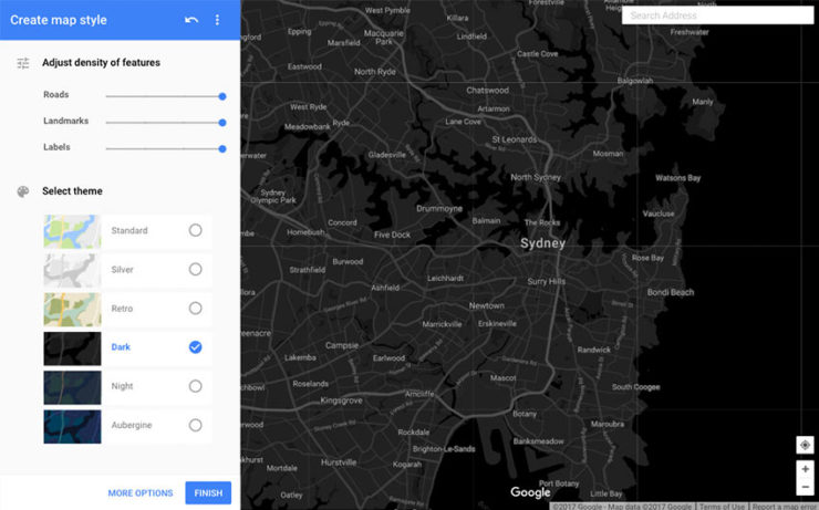
However, thanks to the new Google Maps editor, custom map skins that fit the colour scheme of your website can be created quickly and easily. Expect to see more custom coloured maps used as design centrepieces on websites in 2022.
19. Increase use of pure tones
The Web 2.0 era was characterised by the use of pastels and semi-translucent tones. The flat design revolution saw more solid, pure tone colours come into fashion.
When combined with big typography and creative geometric shapes, pure tones can be a very powerful and eye-catching effect when used correctly. The differentiator to this will be the popularisation of two-two semi-translucent gradients. However, expect to see more solid pure tones used across websites in 2016.
20. Simpler colour pallets
Two design trends that are currently polarising each other are the use of flat pure tones and two-tone gradients. Pure tones were popularised during the flat design trend whereas two-tone gradients have really come into stride in 2016.
Overall, I believe that website colour pallets will be kept simple, with no more than two highlights used in most applications. The exception to this rule will be with brands that make use of two-tone gradients, which can produce a wide variation of colour. Considering the want and need to stand out from the crowd, I predict that two-tone gradients will trump flat design styled websites in 2022.
21. Creative product sliders
Sliders were another element made popular in the Web 2.0 phase. They were an easy way to make a website seem more ‘interactive’ by having otherwise static content slide across the page.
Considering the substantial evidence on why you shouldn’t use sliders, there are a few edge cases where sliders make a good choice for displaying content. I for one would never run a page header as a slider, as the chance of losing a visitor is too great.
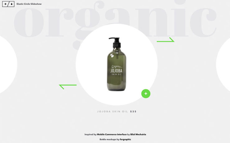
However, displaying secondary or supporting information, such as product variations, sliders can be used quite effectively in these instances. I predict that the use of more creative styles of sliders (the ones that don’t look like a Web 2.0 sliders) will continue to grow in 2022.
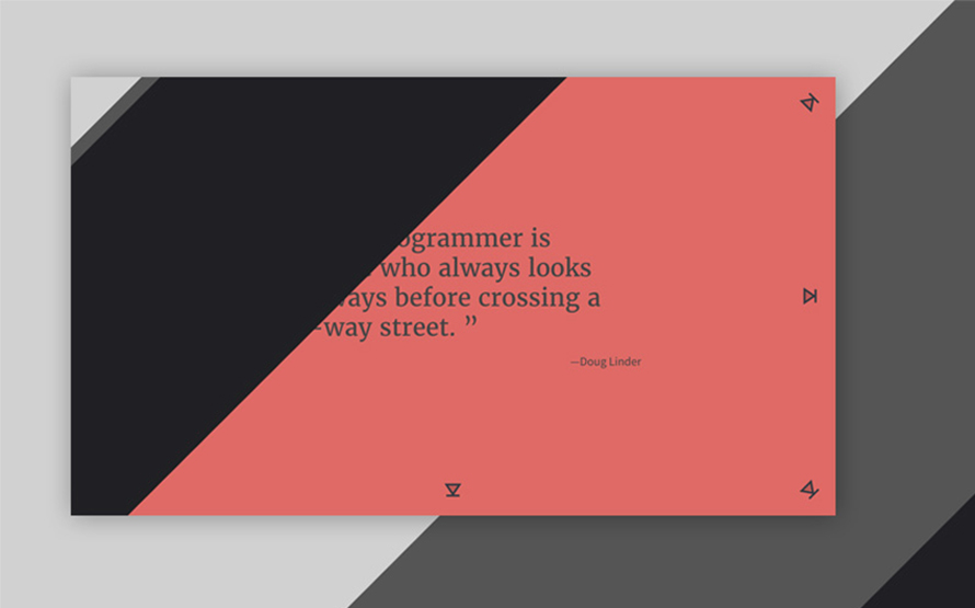
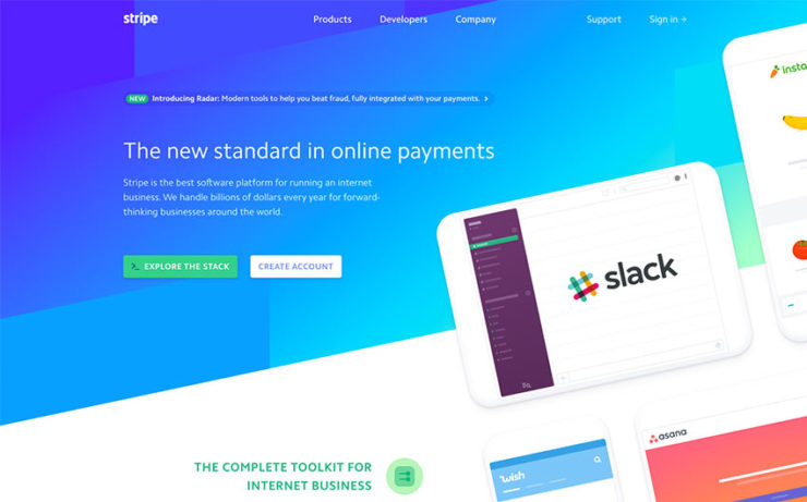
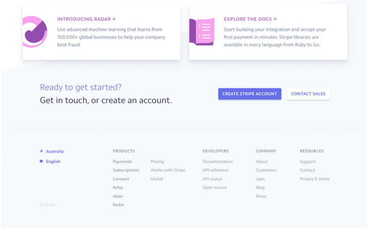
22. Increase use of angled section breakers
Another big trend to pick up steam in 2016 was the use of angled section dividers. In an attempt to break the boxed feel of most websites, angled dividers have been appearing more and more on major websites.
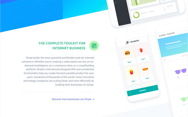
Although they are more difficult to work into a web page design, angled section divider can help to make a website stand out from the rest. The redesign of Stripe.com in 2016 is the best redesign of the year in my opinion.
The website’s use of angled section breaks, contrasting geometric shapes and two-tone gradients has been extremely well executed. Expect to see more website designs follow suit in 2022.
23. More feedback with each interaction
In line with the micro-moments trend popularised with Google, expect to see an increase in small user-feedback touches on common elements such as buttons. As websites evolve from only focusing on wow-ing the user above the fold, secondary elements like buttons and links will become more interactive and intuitive to user-feedback.
Google’s Material Design language advocates the use of user-feedback on all elements that require interaction. With that said, thanks to SVG shapes and CSS3, it is relatively easy to introduce subtle but beautiful feedback animations to otherwise static website elements.
24. Displaying content in a card-style interface
Another trend popularised with Google’s Material Design language is displaying content inside a card-like element. This typically means a box or a ‘card’ with a visual element at the top, the title immediately below followed by a short except description with a read more link at the bottom.
Card-style interfaces are a simple way to give structure and organisation to content when open-style website layouts are used. To really stand out from the crowd, animated feedback effects when the user interacts with the card can create a high-impact design.
25. Increase use of light coloured footers
Dark coloured website footers have remained a common element for many years. However, with the trends moving towards whiter, lighter and open website layouts, light or no coloured footers are beginning to replace dark ones. Footers typically contain information of secondary importance to the content held above it, so it makes sense to not draw the user’s attention to this area.
With that said, fixed footers on mobile devices can be an optimal location to place a call to action or conversion element. Light coloured footers will probably increase in 2022 as a reaction to dark footers, however, I don’t believe, the trend will completely overtake websites using dark footers.
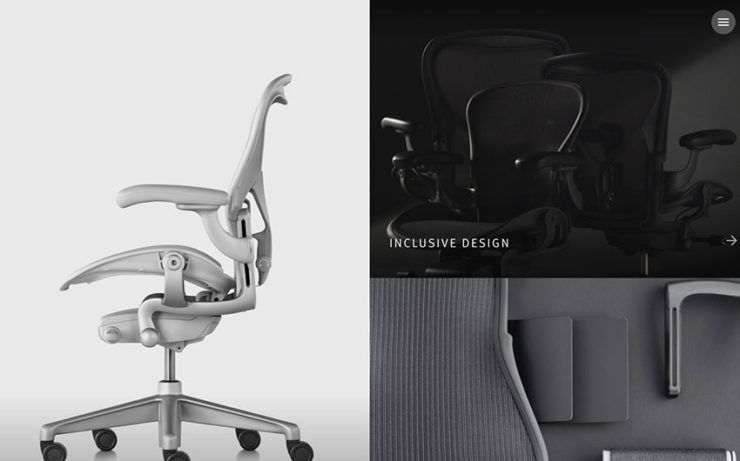
26. Lighter and ‘whiter’ style designs
Another trend to gain a lot of traction in 2016 is the use of light or pure white style website designs. These designs typically make use of one solid white background colour, with no colour variations between different page sections.
The outcome is a very pure, sleek and minimal look, that draws the user’s eye towards focal points through the website’s central content section. I predict this trend to greatly increase in 2022, with dark style designs being used in only very specific edge cases.
27. Creative use of SVG animations
I love SVGs. Thanks to both an increase of high-density displays (Retina, 4k etc) and browser support for SVG elements, SVGs have almost hit mainstream usage in web design. SVGs stand for Scalable Vector Graphics.
The reason why designers love them is because they will always display at perfect resolution, regardless of screen quality as they are mathematically defined shapes, and not static image files.
As high-resolution screen prices continue to plummet, and 4k screens begin to enter the market, I predict SVGs to become one of the standards in modern website design in the next few years.
28. 360-degree video
Thanks to Facebook, Instagram and Youtube’s native support, 360-degree video is becoming increasingly popular across the web. Websites that need to display a physical space, such as a building, landscape or interior can greatly benefit from the use of 360-degree video.
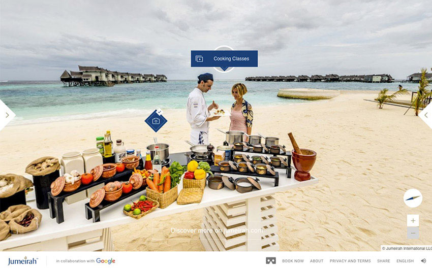
Support for 360-degree video natively in the browser without using Youtube of Facebook is still low, however, expect to see 360-degree videos used more creatively in websites throughout 2022.
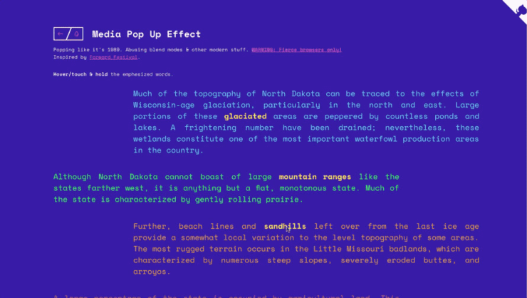
29. Layered animations giving life to static media
Using animated elements in a website’s design is nothing new. However, a trend that I believe will pick up steam in 2022 is the use of layered animation effects to create a unique viewing experience.
As it becomes harder and harder to capture people’s attention when entering a website, creative page header effects and interactive layered animations can really bring life to an otherwise static and boring web page.
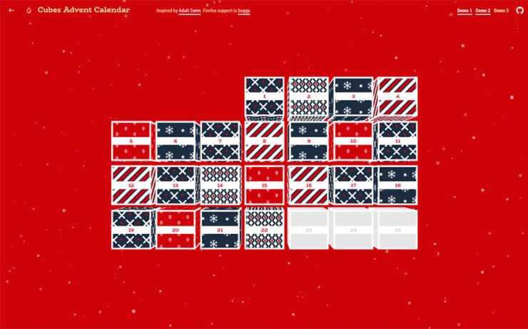
30. Displaying content in isometric & 3D Grids
As web design moves more and more away from box-style horizontal and vertical layouts, isometric and 3D grids are trends to look out for in 2022.
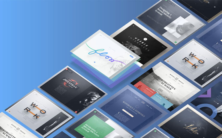
Increase browser support for CSS3 transform code, which allows the browser to manipulate the position and orientation of an element, has opened up a tonne of new web design possibilities.
Coinciding with the increase of angled dividers and geometric shapes, expect to see otherwise horizontal or linear elements displayed in an isometric fashion in 2022.
2022 is shaping up to be a very interesting year indeed. Overall, I do feel web design will continue to optimise itself rather than revolutionise itself. One thing is for sure, we are moving forward to a more beautiful, rich and interactive online world, and I couldn’t be happier having a hand in building it.
Considering redesigning your website in 2022? Book in a complimentary 45-minute project exploration session with myself here.
Thanks for sharing this nice blog James! It is really helpful for many.
Thank you for your valuable collection of web trends keep sharing like this!!!
Thanks for stopping by and commenting! Glad you enjoyed it :)
Great stuff! love the simplicity of the themes!
Thanks El
thanks! The list is awesome and really helpful for web designer
My pleasure!