
This year we have seen a number of trends in the web design industry which is helping to shape the future of web design. Some of the most notable design trends will continue to rise as the internet grows, leaving some trends to fall by the wayside.
Below you will find my thoughts and comments of seven of the most notable web design trends of this year.
Responsive Design
Responsive web design is an ever-growing trend that started emerging in early 2011.
A responsive website is one that has been built using certain modern techniques to accommodate for multiple screens with varying sizes. Whether it is a mobile, tablet or desktop computer, a responsive website will be usable on all of these devices.
There are many advantages to having a responsive website but the two most important reasons are:
- Usability – Not all of your website users will be on a desktop computer and as a result, your site needs to accommodate for this.
- Having a responsive website will aid in Mobile SEO for your website. Google has stated that it has added mobile friendly websites as a ranking factor to its search algorithm.
There will be 1.4 Billion smartphones in the world by the end of 2013 and 84% of smartphone users use their smartphone to browse the web. As a result, responsive web design is a must for the future of successful website design.
If you are reading this from a desktop computer, you can see responsive web design in play by resizing your browser screen. Find out more about responsive websites here.
Minimalism
Simplicity is the ultimate sophistication.
Leonardo da Vinci
Minimalism in web design emphasises simplicity. This trend makes use of the bare essentials so that the content is the focus. Just like Leonardo da Vinci said, “Simplicity is the ultimate sophistication.” Modern websites are taking the simplistic design approaches to create stunning and sophisticated websites.
This is becoming more and more evident throughout design and user interfaces across the world. A most recent and widespread example would be Apple’s iOS7 software update.
Apple removed a lot of visual chrome and simplified much of the system’s design elements overall. This has been done so that the user’s attention is more focused on the device’s content, rather than the design and user interface (UI) aspects.
Typography
There are always different types of typography trends revolving around. Using big bold headlines with a number of paired fonts is an apparent trend right now.
An important key point to picking the right font is to ensure that the typefaces reflect the brand and the website’s overall visual style. It is important that the fonts you use are easy to read, especially the paragraph fonts.
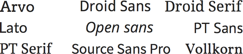
Google hosts a large number of freely available fonts for your website on the Google Fonts database. There are however a number of not so great fonts on Google Fonts, so if you are new to typography, prior research before settling on a font is detrimental.
Some of the best and most widely-useable Google Fonts are:
Parallax
Parallax is an effect whereby the position or direction of something appears differently when viewed from different positions. This effect has become very common in modern websites and is commonly referred to as Parallax Scrolling.
It is often a subtle effect where your background image will scroll at a slower pace than your foreground content. By making the background scroll slower than the foreground, this creates a parallax effect and will increase the users experience on your website.
Some recent parallax scrolling websites we have built can be seen on the Knightsbridge Limousines and French Rendez-Vous websites.
Infinite Scrolling
Infinite scrolling is another usability feature that is ever increasing in popularity.
Infinite scroll allows for large amounts of content to be loaded and appended onto the page when the user reaches or is near to the bottom. A great example of infinite scroll is in use on the social media site Pinterest were a number of new pins are added to the page when the user scrolls near the bottom.
Even Google is using infinite scroll with its image search results page. Infinite scrolling is a fantastic user experience enhancement which removes the need to use pagination or reloading the page to access the next page of content.
Single Page
Single page websites have been around for a long time. However, they have been appearing in huge numbers, particularly this year.
Displaying all of your content on the one page can help reduce user resistance as users will be able to continue reading content without having to click off to another page. For each page your user has to click on to access, the longer they have to wait and the more chance they will exit.
People are able to make buying decisions quicker if the information they want is made immediate to them.
Usually, single page websites have navigation links that scrolls the user up or down to different sections of content. Each section of content will usually have its own distinguishable heading and/or background as a way to break the page up and will allow users to quickly and easily find what they are looking for.
A single page website is not recommended if your website requires a very large amount of content to be displayed as navigating through it will be a difficult task. If your website does have a lot of content, then it is best to break this content into navigable sections on different pages.
You will often find a lot of the trends mentioned above featured on many single page websites including parallax scrolling, minimal layouts and large bold typography.
Content First
Finally, one of the last big trends we are seeing is the content first design approach.
In the past, web designers and web developers would introduce extravagant layouts with lots of glossy or gradient filled visual elements into their websites. It has quickly become clear that by over crowding the site with this visual excess will decrease the main objective of the site which is to get the content across to its users in the easiest way possible.
You will find that these designers would first build the layout, and then add in the content after which would often result in a websites that are difficult to use since the layout hasn’t been optimised for the content. By planning the content needed for a website before you start developing, you will be able to map out the architecture of the site to best fit the layout.
This year we have seen a large number of new trends emerge, and some existing ones grow and evolve.
Some of these trends, such as responsive design and the content first approach are starting to form the modern web of future web designs.
What design trends do you see happening across the web?
 Trusted by 450+ great brands
 Multi Award winning web agency
 15+ year track record of real results
Nice blog! Thanks for sharing such an informative blog with us.