
Having a website is a must for any business or individual brand.
Choosing the right imagery is crucial for building a captivating website that tells an engaging story.
Big brands rely on large content creation teams or external design agencies but most small businesses should cope with a tight budget and make their websites largely themselves.
It is quite possible and some of the most creative and appealing sites are actually made by independent designers and organisations that put a lot of effort into developing a great site for their product or service.
Of course, you have to be mindful about your site and optimisation of images for it, but the pictures you choose is as equally important. So, how do you choose the right images for your website? Here are 5 elements you definitely wouldn’t want to miss out.
1. Stock photos offer plenty of choices
You need not pay to find suitable images to use on your website. Free services like Unsplash, Pexels, and Pixabay, among others, provide free stock photos while some images are free for commercial use and do not require attribution.
You can save a photographer’s day by donating to his or her account but you can still use the image as you have taken it yourself (without giving credit to yourself, of course).
What is more, these are searchable photo directories and they also provide collections of photos sorted by intended use or by topic. You can, for example, search or browse minimalist images for your minimal website or blog.
Although a good number of the images uploaded to free stock photo sites are overused, you can still find unique and appealing photos for your particular website. You just need to avoid editor’s picks and most popular pictures since they already appear on too many other sites and blogs all over the world.
2. Authentic always rules
Being authentic is mandatory if you want to grab visitors’ attention. You can afford to be a bit boring in particular service pages used by established customers or site members but the first impression is, well, the first impression.
You need to provoke real feelings that resonate with your core virtues in a natural way. A picture like this one is far better for the landing page of a wedding service than a boring picture of a young couple surrounded by partying guests.
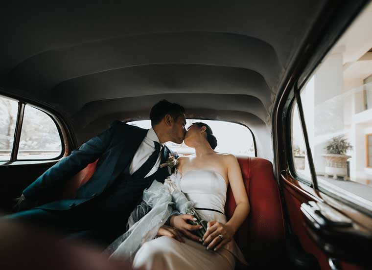
You get the point, there obviously will be a party somewhere and your service is offering to take care of all the details. Nonetheless, the intimate moment of mutual love is what matters to your prospect customers, not the happy faces of other people at their wedding party. And the above picture is pretty authentic in addition.
3. Real is authentic
Real is always authentic. Aim for real images that interact with the core idea of your website design. You can easily spot what particular emotion the below picture is targeting: relaxation.
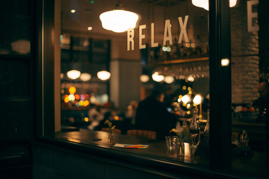
What is great about this picture? Well, it works as silent movies used to work by implying a feeling: “Relax!” Its mild tones are the opposite of the usual bright images that show happy faces in a crowded public gathering place. An obscure figure is seating relaxed at a bar table while the entire picture is suggesting it is a very private place to sit and relax. More importantly, this is a real photo taken in real life, not an agency-arranged interior.
So having real-life pictures on your site makes it more human and tells your visitors a real story. This approach is working in any field or industry, while readers and browsers are overwhelmed by corporate and ultra-innovative sites that have little to none human touch. Of course, images should fit your target audience and customer personas but genuine images can do half the job in attracting the right customer.
4. Add creative action to convey your message
You need scenes with some type of action, best if you can add creative actions, in your images to grab visitors’ attention and convey your message.
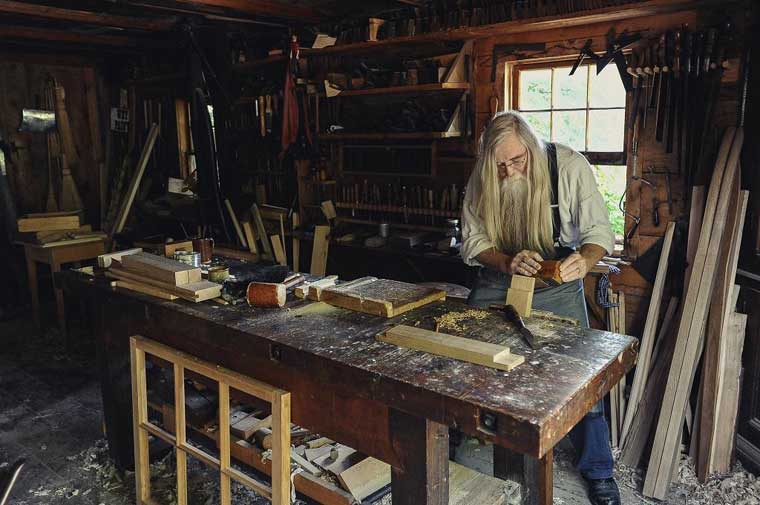
This stock photo can be used for a variety of services or websites. There is action: a person is busy creating something out of wood. There is a message: an experienced master of his craft is working on the next beautiful thing. It does not say whether it is corporate environment or the act happens in someone’s backyard. It could be both.
The picture implies a feeling of comfort and dynamism, the colour palette is using mild colours while the gentle movement does not make the image overwhelmingly dynamic.
Sure, you should pay attention to image properties such as focus, brightness, and contrast but the very action the picture is showing will express core virtues such as craftsmanship, peace of mind, and natural lifestyle.
The image should also adhere to a certain colour pallet to be consistent with the overall concept of your site. Yes, you should have a brand concept about the use of colours.
The above image easily integrates into a colour pallet based on dark blue that is only suggested in the lower right corner. The picture colours gradually shift from dark brown in the top left section to nearly silver. The dark background on the left enables the use of fonts in white, while you can place an actionable message in colours in the right half.
5. Use white space strategically
You need white space in many of your images to create an airy feeling, have space for headlines, and embed call-to-action messages or buttons. The images should be striking for your call to action to work. Something like that:
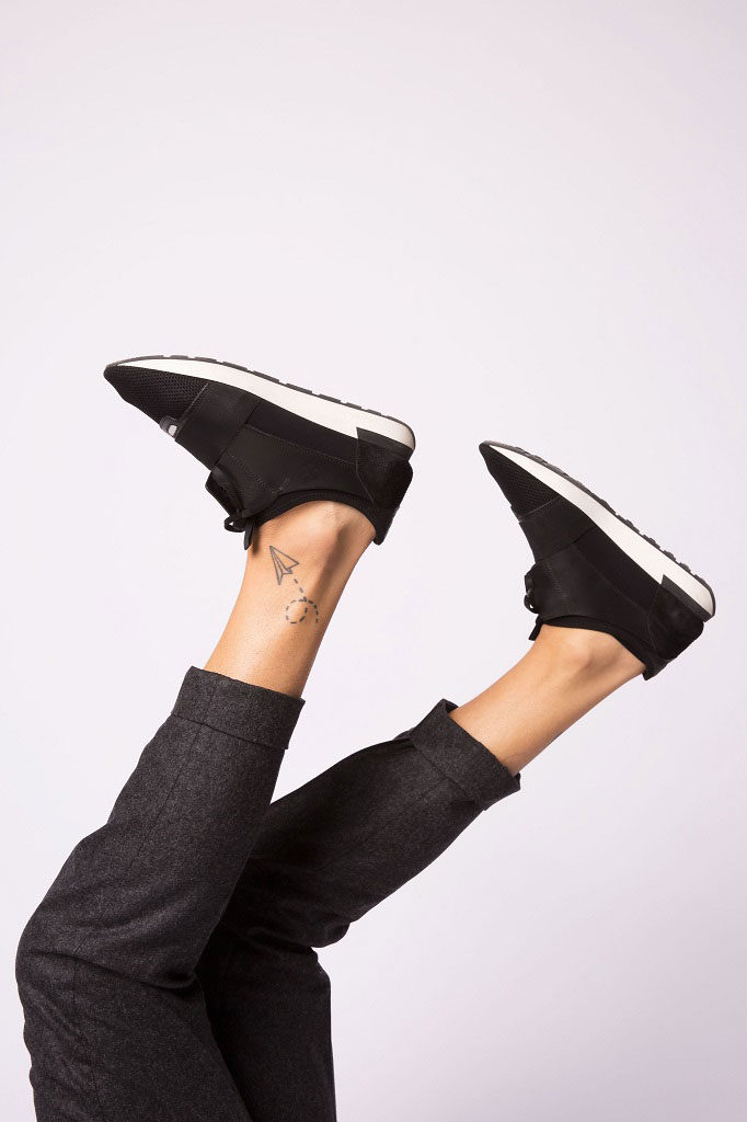
This image has action in it and strikes without being intrusive. You have enough space in the upper and the lower sections of the image to insert a message and call to action while the dark colours create a perfect contrast for livelier font colours.
Even if you wrap the image in text it will still have fair enough white space not to burden the eye of the reader. The same applies to the picture being placed adjacent to another image. In short, you need white spaces in most of your pictures and you need striking ones to grab attention.
Conclusion
It is as old as design itself but is worth recalling: keep it simple. You need no excessive number of pictures to showcase your core message and create an appealing experience. Also, keep it simple in terms of what the images exactly convey as a brand message.
Lots of appealing photos are free to use yet many of them may confuse your visitor by expressing too much of an emotion or action. Finding the right balance for an image is key: proper focus, correct contrast and brightness, colours that work together and the right type of action.
Always choose the best.. make sure the design is just right for the products you convey..