Any new business online is facing a lot of competition. There are companies around the world that are offering something similar to you, and you need to stand out.
The best way to convert readers and keep their business is by maintaining a well-designed website. Here’s how you can improve your page and increase sales conversion.
1. Focus on the benefits and outcomes
Most website copy is written about the business, and not about the customer. You need to describe your products and services to resonate with your target audience’s core pains and desired pleasures.
Talking only about yourself and your business serves nothing other than increasing the word count on your page. The key is to keep any sentences on your site short and sweet while framing up the core buying desires of your audience.
If you want to test if you’re writing too much fluff, run your website copy through the Hemingway Editor.

2. Use effective images
The images you choose to display will affect whether a customer chooses to buy with you. Choose the images you use with care. Don’t overload the site with them, but ensure that you’re using enough different angles to show the viewer what they’re getting.
3. Localise your URL
When choosing a domain, it is important to get it right. Even though you’re online, show that you’re a local business. Customers feel more comfortable buying from a company that’s nearby. The easiest way to do this is to localise your URL.
We use exact match URLs for our SEO Brisbane and Web Design Brisbane services because our clients are based in Brisbane.

4. Keep an eye on your grammar
Good grammar is vital on your website. It instills trust in you, and shows that you’re professional enough to care about the quality of your copy.
If you’re writing your copy yourself and need help, there’s services out there you can use. But the main tip you need to remember that you must be free of any annoying typos, have correct title cases and check spelling or grammar mistakes.

5. Be consistent
You need to be consistent in all the information you provide on your page. Again, it’s about trust. If you’re not, customers aren’t going to do the investigation to find out what the correct information is, they’re just going to leave. Double and triple check all of your facts.
6. Put the call to action in your URL
Many sites put a call to action somewhere obvious, but you can put it in your URL. For example, https://web3.com.au/receive-our-emails/ has the call to action right there. It’ll help pull in people who are Googling for what you’re offering.

7. Have one, clear message
If you have too much going on on your landing page, then customers will be confused by what you’re trying to say. Pick your most important goal, and steer them towards that.

8.Proofread your copy
You must do with this every word you post on your site. As with your grammar, well proofread text shows you’re a professional company and you care about what you put in front of the customer. There’s services you can use if you can’t proofread yourself. Web3 can certainly help if you are rewriting your website copy.

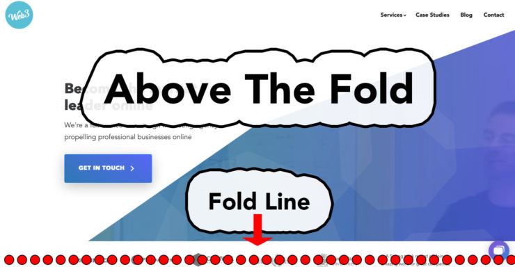
9. Keep important information ‘above the fold’
Most customers aren’t going to scroll down your page, unless they’re really motivated. Keep your call to action, forms and other information visible on your landing page when they reach it.

10. Don’t give too many options
It’s true that too much choice is paralysing. If a customer’s unsure which option to pick, they just won’t buy from you. Narrow the options down, and give fewer choices. It’s surprising how much this actually increases sales.
Use these tips to improve your site, and your conversion rates will soar. You can compete with the bigger companies, if you show you care about the customer experience.
That was a guest post from Mary Walton. Mary Walton is a content manager at Essayroo.com. Read Mary’s blog: SimpleGrad.com, there students may find useful information on education and college life.


