Following on from our 2013 article on the web design trends, we have got Katie Wright who is a graphic designer in Brisbane here to give her thoughts on what will happen with web design in 2015.
She shares her experience on the future of web design and some of the trends that we will be seeing in 2015. Take it away Katie.
Web Design Trends in 2015
As I sit in a crowded lecture theatre, I am feeling so grateful to be there and excited to learn and grow as a designer. At this stage, I look around the room to find a seemingly less enthusiastic crowd tapping away at their iPhones, iPads and laptops, making good use of the free wifi for some much needed personal web time.
My concentration is suddenly brought back to the front by a loud voice saying “now pay attention, you will need this later.” Almost the entire room silently and systematically takes a photo of the information on the projector screen with their smartphones, barely looking up and then promptly go back to whatever it is that they were previously ‘working on’. – And before you ask, yes, that really happened.
Times are changing I guess.
As a fledgling designer, I couldn’t help but reflect on this situation in terms of how our use of mobile technology is changing and how that reflects on our work and the needs of our clients.
The way the internet is consumed and accessed is moving at lightning speed, with most adult Australians owning a smartphone and/or tablet as well as the traditional desktop or laptop, the web is accessible from everywhere.
Most of the forecasted web design trends leading into 2015 and beyond revolve around the concept of a far more portable and accessible website, accommodating new and existing technology in an effort to make themselves as reachable and universally usable as possible.
These include more responsive design solutions, flatter and more mobile friendly designs, less text, more imagery and our old friends typography and colour. These all work together to create a much more hospitable environment for mobile technology as well as traditional desktop access.
There is no doubt that web use and therefore the web design industry is on the rise, with more and more people using the internet in more innovative ways every day. The way we are using the web, however is also changing as technology grows. The increase in smartphone usage is a major factor affecting the web design industry.
According to the ACMA Communications report 2012–13, over 11 million Australians have a smartphone (well over half of the adult population). Of these, 7.5 million accessed the internet via their mobile phones, an increase of 33% from the previous year.
Additionally, 62% of Australians going online used three or more devices to access the internet in the six months to May 2013.
In response to this increased and more flexible approach to internet access, there are several areas of web design that are sure to dominate the design world in 2015. Most of which are geared toward the rise of smartphone and tablet usage among the general public. These are:
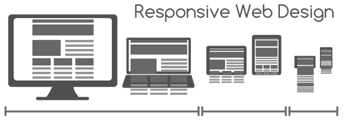
Responsive Design – With mobile and tablet users set to take over the world, it makes sense that companies would try to make their websites more user friendly and streamlined for all platforms. That’s exactly where responsive design comes in.
Responsively designed websites detect the screen size that the user is viewing the website from and resizes and responds accordingly. Therefore, whether you are viewing it from a desktop, mobile or tablet, you are sure to get a consistently usable and visually appealing end result.
Responsive design also has plenty of room to move into the future as we are introduced to new technology such as smart TVs, smart watches and the list goes on. Watch this space.

Flat Design – Goodbye gradients, bevels, shadows, patterns and textures (or heaven forbid a lovely cocktail of them all), hello beautiful, clean, simple design.
Flat design burst onto the scene in late 2013 with the release of the then controversially minimalistic design of Windows 8. This style has definitely caught on since then as it has been on the rise through 2014 and set to really shine in 2015.
Flat design combines clean, simple lines and the use of white space to convey an uncluttered and elegant design style which is very user friendly, quick to load and visually appealing.
It also lends itself very well to mobile and tablet users, what’s not to love?

Scrolling – Once again, the mobile users win in the website wars with the rising trend of scrolling websites rivalling the typical multi-page layout. As scrolling through content is much easier for a mobile/tablet user than clicking to navigate from page to page, this really is a smart way to navigate.
It is however important to note that multi-page sites do pack more punch when it comes to search engine optimisation (SEO) and visibility.
Less Text – Once again, the mobile viewers of websites get a look in with the use of less text, bigger images and more icons/infographics to convey information. This is particularly useful to team smartphone as it is far easier to quickly take in an image than squint at tiny text or (gasp) pinch-zoom.
This visual storytelling as a means of conveying information is also effective for the time-poor among us as it is a very quick and easy way to digest and remember information. Text however still has a very important role to play within web design, it conveys detailed or technical information more effectively and unambiguously, making it vital for conveying notifications such as terms and conditions, instructions or articles (e.g. the news).
Also, text is important once again for SEO.

Typography – Well and truly gone are the days of Arial or Times New Roman dominated websites. With increased accessibility to high quality, reasonably priced web safe fonts, the last few years have seen a rise in more creative, expressive and varied typography within web design than ever before.
This is only set to rise into 2015 as the catalogue of available options continue to increase.
Also predicted to play into future website typography selection is font size. It appears bigger typography will certainly be better with the rise in smaller screen usage and minimalist design styles.

Colour – In the world of web design, colour schemes of 2015 will be to one extreme or the other.
At one end of the spectrum, we are seeing a rise in the use of monochromatic colour schemes, using shades and tints of one or two colours only, adding to the flat, minimalistic visual style which is on the up at the moment.
At the other end of the spectrum, we have the hypercolour trend. This trend uses a vast and striking colour palette to achieve an eye catching and visually powerful website that will stand out from the crowd.
Either way, as long as you stay away from the middle, you will be right on the money in 2015.
As a designer, these trends are all very accessible and relatively easy to incorporate into upcoming projects.
As always, learning new skills requires time but the investment will show in the end result. Most of the trends mentioned such as colour, typography, imaging and flat design simply draw upon basic design theory and reinventing it in creative ways to achieve the intended result.
However, if you are not a wizard in the web design department (or even if you are), you may need to brush up on your technical skills to produce good responsively designed and/or scrolling sites.
Following the Web3 blog will be of great benefit as valuable new content aimed towards small businesses and website owners is added on a regular basis.
As you can see, most of these design trends are based on the changing needs of the ever-widening mobile web user market.
Consumers are always going to want the most functional, fast, and of course beautiful solution possible. Businesses who don’t consider the needs of the mobile web user are certainly leaving themselves behind and distancing their product from the majority of users, potentially affecting their bottom lines. If web design is something you will be sinking your teeth into next year, keep these trends in your ideas bank as a good first step toward being ahead of the competition.
With mobile and tablet users set to take over the world, it makes sense that companies would try to make their websites more user friendly and streamlined for all platforms.
What trends are you seeing happen in design this year? How do they compare to when this article was written back in 2015?
 Trusted by 450+ great brands
 Multi Award winning web agency
 15+ year track record of real results
Web trends in 2015 will also include responsive websites, flat design, large background images with typography, video background, on click scrolling and may be 3-D.
Thanks for sharing Allen. You’re on the money!
Hi there,
Nice article. No doubt, scrolling design trend seems to be the best. But don’t you think it will be a great threat for a website’s SEO?
Thanks for the comment Daniel. Ultimately, it boils down to what’s best for the type of user that you are wanting to engage with on your website. We find that long-form scrolling pages both engage and convert better than the more traditional short-form page by page structures. Of course, it is important that you apply the best onsite SEO practices regardless of what style you decide to go with, but that’s our position based on what we have seen that has been working well so far this year.
its 2015 , a new way to surf the internet now with different Style , different way , different instruments :)