Do you have an E-commerce store or looking to start one? There is a lot that goes into having a successful online store.
We have built countless online shopping solutions for businesses and through years of testing and measuring, have seen what works and what doesn’t.
Here are 10 of the most important features that every e-commerce product page must have.
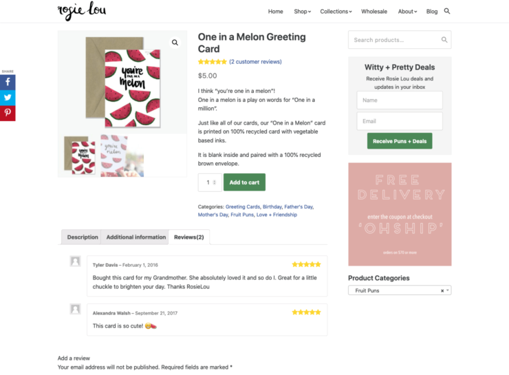
1. Quality Images
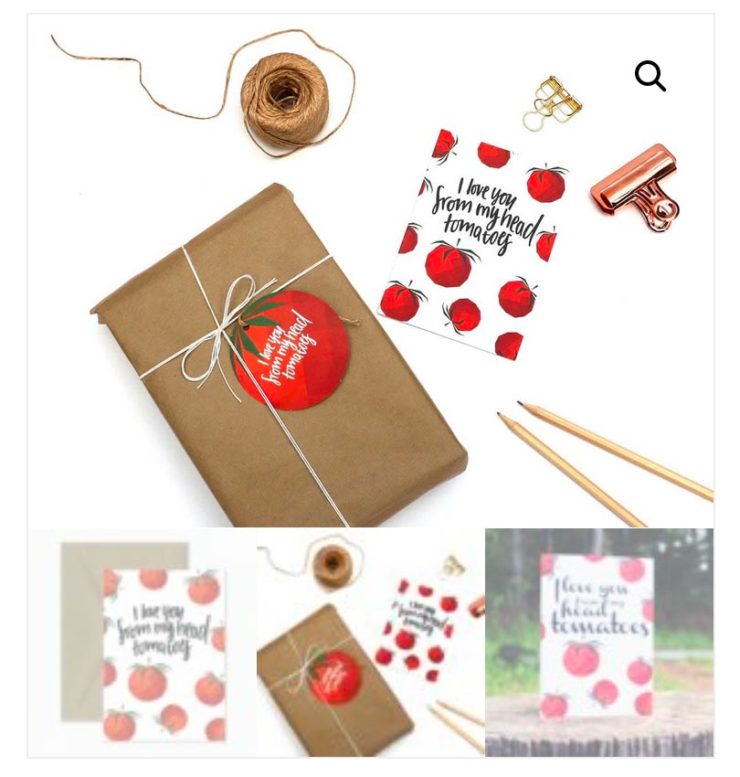
Quality images can make or break your websites E-commerce user experience.

When you are browsing products on a screen, they need to invoke the same emotional response that you would get from experiencing the physical product in real life.
This can be achieved through large professionally shot product images that demonstrate all the aspects of your product. If the product has multiple sides or features that are different then they need to be captured in separate images so that the user can see if the product is right for them.
To have a successful product page, you should be trying to stimulate as many of the users five senses as possible (sight, hearing, smell, taste and touch). Because it is hard to touch most of these virtually, strong use of imagery is very important to achieve this.
On a typical E-commerce product page, you will have the ability to add multiple images in a gallery. If the product has variations such as size, colour etc., be sure to include all of these images to show the variations.
As well as displaying images of the product, you might want to consider it in the context of where it is being used too. i.e. an action shot of the product in the wild.
Just be careful to optimise your images if you’re going to have a lot on the one page otherwise it will slow down your site even if you speed up WordPress.
2. Zoom In Feature
Once you have amazing product images, it is important that they are displayed so that the user can view all the tiny details of each image.
Typically you will see one large product image with all the following images as thumbnails below it. It is a good user experience for the images to be able to zoom on hover. When the user clicks the image, it will go into a fullscreen popup gallery for the user to see.
Most e-commerce platforms have this built in. Consider enabling this functionality if not.
3. Add to Cart Button
The shopping experience needs to be as fluid and seamless as possible. This means that it needs to be easy for the user to checkout and purchase your products.
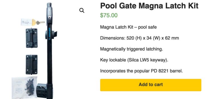
The add to cart button needs to be clearly visible and obvious to the user for them to click/tap. Users expect for the button to stand out. If they cant find it then chances are, they will buy from your competitors or elsewhere. In some cases, you will see Call To Actions (CTA’s) stand out by being a completely different colour to all the other elements on the page. Good conversion rate optimisation will determine if this is necessary for you.
You should also consider that the buy button needs to be visible on the screen no matter where you are on the page. If your page has long content and your buy button is at the top, by the time the user reaches the bottom, they will need to scroll all the way back up to buy it.
A better way may be to have a floating button (one that stays in the same position no matter where the user has scrolled) so the user can click to checkout at any place. Another option is to place multiple buttons across the page.
4. Customer Reviews
People often buy on recommendations.
It is a lot easier for a sale to be made if someone else has already recommended it for you. That is why reviews of the products that people have bought are so powerful.
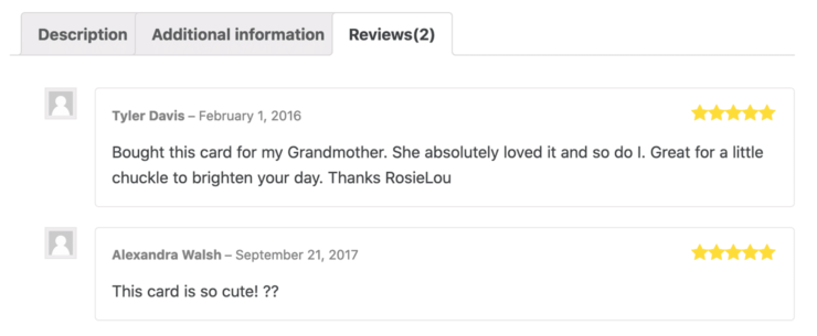
Your product should be good enough that the people recommending it will give you a good review. You can’t please everyone however so don’t be afraid if there are some reviews that you are not happy about.
Your E-commerce platform should have commenting and rating systems built in. This makes it easy for customers to leave a review. You will find more times than not, people will not leave a review so you have to ask for it.
Customer reviews are earned. It can be difficult to obtain reviews especially if your sales volume is low.
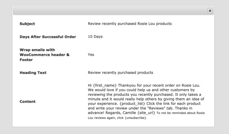
An easy way to automate requesting reviews is to install a plugin that sends out email prompts at a specified later date after purchase. It will trigger an email to ask for them to add a review if they haven’t already. This helps to capture as many reviews as you can after they have had an experience with the thing they bought. If it has been a good experience then you should receive mostly good reviews.
5. Clearly Label Price
Nobody likes hidden surprises and that is especially the case for hidden fees. That is why you should clearly display the price of the product on the product page.
Price is often a determining factor for some people when deciding when to buy.
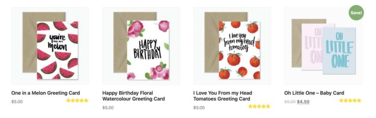
Additionally, If your products go on sale then you should display the price reduction next to the price and indicate that the product is on sale.
If you have products that vary in price, by setting them up as a product with variations, you can define the price for each variation and then it will display a price range. You can adjust it to either display a range or just the starting price.
6. Shipping information
Just like pricing information, shipping information should be clear and transparent.
If you offer free shipping, make it very clear. Free shipping is a compelling offer for many to buy from you.
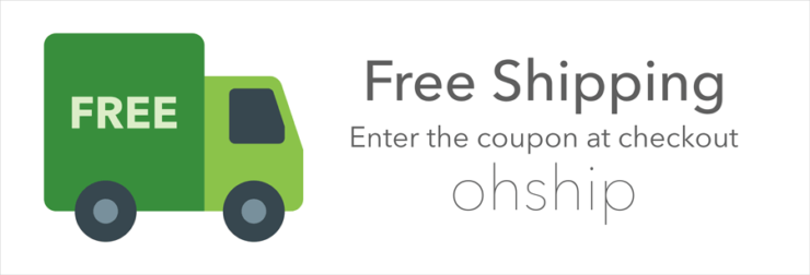
Other shipping information you should include is what company you will be shipping with as well as how long it will take to get to the customer.
Many companies offer free shipping over a certain amount of spend as well as over night shipping or same day shipping. Doing so can certainly entice customers to buy from you rather than physically going to a shop.
You have to be careful thought as it can be a very competitive environment when you are competing against the big guys like Amazon on shipping options.
7. Payment Methods
How you pay for something is a matter of preference. Some people like to be able to pay via credit card, others prefer to use a payment service like PayPal. You should have options available so that people can choose their preferred payment gateway.
Your payment methods should be as seamless as possible like the rest of your checkout process. You will lose a percentage of potential customers for each additional step required to checkout.
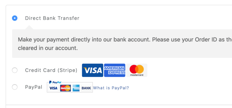
Payment gateways like Stripe allow you to integrate a credit card form directly into the website. This can be a good user experience as they don’t need to leave your site to make the purchase. Whereas some payment gateways will take you to their site to complete the purchase and then redirect you back once complete. That can be less of a good user experience than it all running through the one site.
Finally, if you have customers that make more than one purchase from you (there are so many reasons from a business perspective why you should encourage repeat buy), then it can be a good idea to save the customers card details to make checkout quicker next time. By saving the customers credit card details, you can skip this step next time which makes it less frictionless for the user.
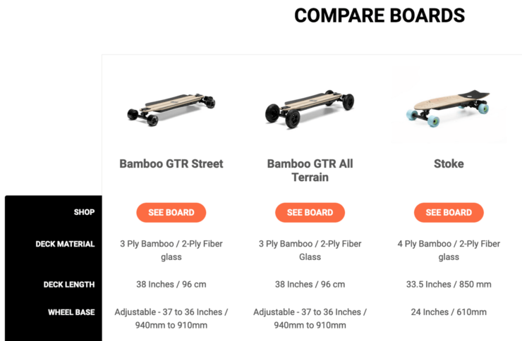
8. Comparison of Products
If you sell a product that has many different models and variations, it can be a good idea to have product comparisons. If you see in your website user analytics that there is a lot of traffic from one product to another similar product and vice versa, it might be a good idea to set up product comparisons. It is the comparisons that can help to make up peoples minds on what product to buy.
Product comparisons can either be a simple dedicated page that you compare certain products on. This is setup as a new page on your site.
Or you can use a plugin that allows the user to compare a selection of products automatically with each other.
If you are creating the content yourself then listing the areas that people compare in a table side by side is most helpful.
By using a comparison plugin, the items that you can compare are based on the attributes and variation data that you enter for each product.
9. Product Videos
The saying goes that an image tells a thousand words so imagine what a video can do. Video works wonders in helping to sell your products. Use video as much as you can because it is able to not only touch the sight sense but sound as well. Like I mentioned above, by touching human senses, you are able to engage potential customers a whole lot more.
Use video to tell a story. Video can be used in a number of ways. It can be used to show off your products in the same way you would with images or it can be used to show your product in the context where it will be used.
Video is massively important on websites. Users engage better when they can see and hear things at the same time.
Video is good to use in almost every circumstance and we use it on a number of our service landing pages too.
10. Live Chat
Live chat is a perfect way to catch the user and answer any questions they may have. It can play a big role in providing great customer service to the people on your website who may be buying from you.
Live chat can be the difference between someone buying your product or not. It is one of the ways people have overcome the good customer service conundrum or lack there of as a result of the whole experience being virtual.
Good live chat is hard to do because it requires someone to be at the computer all of the time. If you are the business owner then that is simply not a viable option.
If you have an employee operating the live chat then it can be expensive too. That is why you should consider investing in managed live chat services. That way, you pay a fraction of the price but are able to get the same good service.
Conclusion
There you have it, the top 10 things you need to consider on your E-commerce product page.
In this article I provided a general overview of ways to improve your E-commerce product page. If you would like to learn more about specific areas then please add your comment below or get in touch.
Do you operate an E-commerce website? How has implementing these 10 factors improved your shopping experience and conversions?
Thanks for the detailed guide.
You forget 1 point. As a SEO guy a would love to suggest a feature called Keyword cannibalization. Keyword cannibalization occurs when multiple pages of the same website are trying to rank for the same keyword.
Hey Rohan,
Yes that is a valid point for improving overall SEO architecture of a website. Its certainly something that should be considered very early on when you are planning how the site should be built. This might be a good tip for our SEO tips post.