
A common tactic in attempting to improve a website’s search position rankings is to hide keywords. This is typically done by:
- hiding the text underneath images or containers
- hiding the text against a background of the same colour
- moving the text off the edges of the web browser window
Hiding text in an attempt to trick Google is a violation of Google’s Quality Guidelines.
An easy way to spot if your website has hidden text, is to hold control (or command) + A on your keyboard. This will highlight all rendered text on your webpage, which will make it easy for you to spot any hidden text.
Google’s main goal is to send its users to websites that answer their questions and provide great user-experiences.
That’s why poor website design decisions can also affect your site’s ability to rank. For example, placing small white text over a white or a light coloured background is bad for usability.
This rule is important for users who have vision impairments.
If you are unsure if your website text is difficult to read, you can use this calculator here to find out. The calculator will figure out the contrast ratio between the text colour and the background colour.
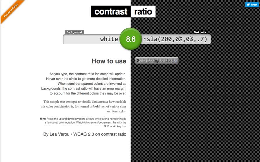
If the ratio shows green, you are fine.
If the ratio is in orange, and the text displayed is not important to your website visitors, you can keep it that way. If the text displayed is important for your website visitors, you should either darken or lighten the text or background.
If the ratio shows red, lighten or darken the text or background until the ratio is green, then update your website’s colours.
Not all hidden text is bad in Google’s eyes. For example, writing useful alt descriptions for your website images will help to improve the user experience.
If set, Alt descriptions load along with the code and displays your images on your website.
However, alt descriptions are not rendered on websites and are not visible to the user. Alt descriptions are useful when users that have vision impairments, and use screen reading software like JAWS, to assist them in reading webpages.
Screen reading software will read the image’s alt description back to the user when the user mouses over the image file. That is why it is important to set descriptive alt tags for all images used on your website. Additionally, Google also recommends writing human-readable captions and descriptive text around your images. This will help to create a more contextual and useful website user-experience.
Do’s
- Make all website text easy to see and read
- Place all website text on a high contrasting background e.g black text on a white background
- Write descriptive and useful image alt descriptions and captions
- Include descriptive captions and text along with your website images
Don’ts
- Use white text on a white, or lightly coloured background
- Hide text underneath an image
- Use code to position text beyond the visible edges of the web browser
- Setting the font size to 0, or to a size that is too small to read
- Disguising links by only linking one small character in the text description, such as a hyphen, comma or full stop.
Really helpful info. i newly started SEO Services in Brisbane and your tips and suggestions will help me lot. Thanks
thanks , articles on how to write in this web , are very helpful .
regards.
Jasa pembuatan Website BikinDesainSitus.web.id
Thanks Hamzah glad you found it useful!