Arguably the most crucial element of a business’ image is its website. In this day and age, potential customers and clients are most likely to visit a business’s website instead of phoning or visiting in person before engaging in their services. However, having a website is no guarantee that the customer or client will engage in that business’ services.
Rather, this first point of contact may in fact put customers and clients off and force them to look elsewhere on the internet.
When it comes to your website itself, there are three areas which are crucial to look at. Those areas are design, usability and SEO.
This article will look at design faults that websites commonly experience and how they can be dealt with to ensure the visitors stay on your site longer and ultimately engage with your business.
Because users are visiting you in person or giving you a phone call, they want to know whether or not your business is what they’re looking for, and they want to know it fast. If the visitor can’t figure out exactly what your business is about within the first few seconds of visiting your website, they’ll most likely close that tab and try the next result that Google gives them.
This is why it’s important to make the information on your website’s homepage as succinct as possible.
Don’t use splash pages!
Welcome pages, also known as a ‘splash’ page can make on average 25% of visitors leave immediately.

For those unfamiliar, this is a page which is blank except for a welcome message and a click through button or two that lets you into the homepage (this also has SEO implications which will be discusses in a later article). As mentioned before, visitors want to know what your business is immediately.
A splash page is only a hindrance to this.
Use media only to enhance the content
Though it may show off your web design prowess and make your website look fancy, having moving visuals will most likely distract your visitors from the real content of your site.
Use animations and movements sparingly and focus on the impact that it has on your users. It might not be a good idea if it affects how people use your site. These include any animations, auto-play videos, background music or scrolling and/or flashing text.

However, if there is a clear way to stop the video or sound playing, this is fine because your visitors have the option of listening/watching or not. Embedding videos from YouTube or Vimeo is popular among web designers because visitors can easily start or stop the videos if they want to.
Forcing them to watch videos without being able to continue what they are wanting to do on the site will more than likely make them exit your site.
Pop-up windows are another thing to stay well clear of. As an indication of what the internet thinks of these, a Google search for “pop-up window” reveals that a lot of the entries are devoted to telling people how to block them.
Pop-ups do have their uses but providing visitors with information (this is called interruption marketing) while they’re on your website is not one of them.
Focus on usability for your users
Does your website’s navigation buttons have written text labels on them? Text that you can actually select by highlighting it with a mouse or is it embedded as an image?
It may not seem like a big deal, but not labelling navigation buttons is highly detrimental and can put visitors off. This is a term called ‘mystery meat navigation’.
What this means is that visitors won’t know what a button does until they hover their mouse over it. If they have to hover their mouse over every single navigation button to find what they’re looking for, they will likely get frustrated and leave your website. Even if each navigation button has a different symbol on it, this is no substitute for text labels.
While we’re on the topic of navigation, does your website scroll down or sideways?
There’s a reason why the scroll wheel on your mouse is up and down, not side to side (well, most mice at least). Just like reading a piece of paper, up and down reading is far easier on the eye. Even if the website itself is designed to be read top to bottom, it is still important to make sure that all of the pages fit on a computer monitor or mobile/tablet device.
You don’t want to have any pieces of information that are slightly too far right to be placed on the screen.
So, your website’s homepage is easily accessible, succinctly describes what your company is about, is devoid of pop-ups and non-mutable music and each navigation button is appropriately labelled. But, what sort of colours are you using?
Use good contrasting colours
Use of different colours can make a website look more engaging, but this can often be a detriment.
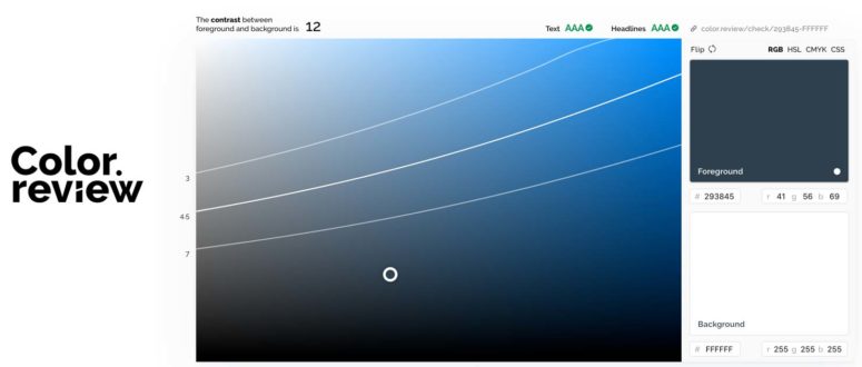
The reason why most text, both in print and on computer screens, is black text on a white background is because this is the easiest combination for the human eye to read. This is to do with colour contrast.

High contrast colours (such as the previous example) are easier to read than low contrast. One huge advantage that webpages have over printed pages in that there is no extra cost involved in using colours.
This doesn’t mean that you have to go overboard with them.
Using too many colours with no clear meaning or reason on your website can not only distract viewers from what you’re trying to tell them, but it can also make your business look unprofessional.
This is only a short introduction to reasons why your website’s design could be turning potential customers and/or clients away. Of course, your website’s design could be totally fine.
However, that doesn’t mean that the website itself can’t improve in other ways.
Website Usability
Usability is how visitors interact (or lack of) with your website. If your website usability is poor, it can force users to look elsewhere on the internet. This is how you overcome usability issues on your site.
If your site is taking too long to load, this may cause the your visitors to close that tab or hit the back button and go back to Google and try the next result.
If your website’s homepage loads quickly, your visitors will be far more likely to stick around and see what your business has to offer them.
Grabbing your visitors’ attention is very important of course, but grabbing it too much can be a bad thing.
Make sure you write grammatically correct
Things like CAPS LOCK can seem somewhat intimidating. Having caps lock on is, in a way, the text version of yelling at somebody. Your visitor’s don’t want to be yelled at. They want to be told what your business is all about as succinctly as possible.
Also, Using Capital Letters When They’re Not Necessary Can Make Your Website Look Unprofessional (erratic capitalisation intended).
So too can having spelling errors.
When writing the text for your website, proofread it as many times as you can. Then, once you think you’ve proofread it enough, give it to somebody else to proofread.
Although you would think checking spelling and grammar of your own website before making it public would be common knowledge, it is still quite easy to find a website that has not been proofread properly.
A website can have perfect spelling and grammar, yet still be difficult to read.
One issue that many websites have is the ‘wall of text’. This is where large amounts of text are clumped together in large paragraphs. This style of writing is appropriate for books and academic literature, not your business’s website.
If you need to give your website’s visitors a lot of information, it is better to do this using shorter paragraphs interspersed with images. Having paragraph headings or even simple horizontal border lines can also help the reader This will make it much easier for your visitors to understand what your business is all about without getting lost in a huge clump of text.
Add contact details
It’s all well and good for your visitors to be impressed with your website. However, in order for your business to be successful, these visitors must then actually engage in your services.
If your business’s contact details can’t be found, your visitors are unlikely to go any further than browsing your website. This is why it’s important to have your business’s contact details easily accessible no matter where they are on your website.
The details should include a telephone number, street address (unless you run a home business and don’t want to give out your address because you service customers at their location) and email address.
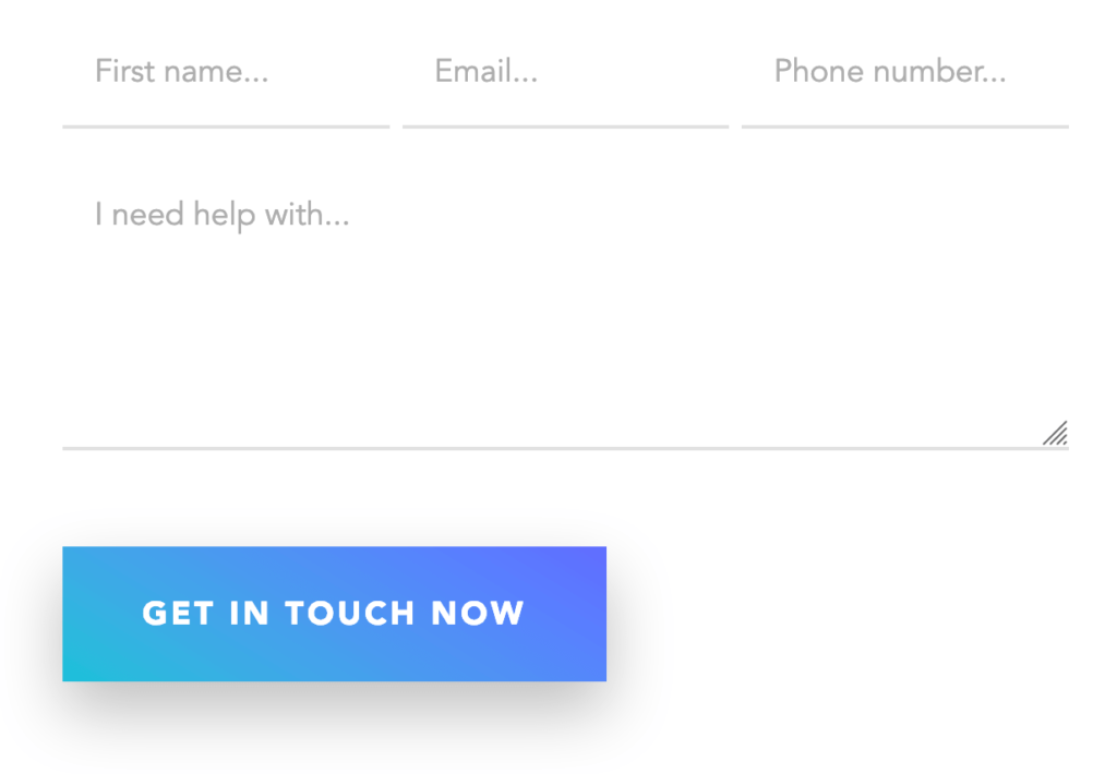
Most websites have a contact form which is usually found on a contact page. A contact form is a set of input fields where users can fill out and submit. Once the form is submitted, the information will be sent to you via email directly.
This is what they typically look like.

The biggest advantage of having a contact form is that you can hide your email address from spammers.
From the visitor’s point of view, having a contact form means they don’t have to open their own email program in order to contact you. Indeed, your visitors may be accessing your website from a computer that doesn’t have their email set up on it. This means that visitors can contact you no matter which computer they’re on.
Use PDF content on your website
PDF files are a useful way to provide more technical details. Indeed, PDFs are usually where walls of text are found. However, there should only be two reasons why you would have PFDs on your website.
- The first is to provide more technical details that are suited to walls of text.
- The second is if that information needs printing like an ebook or a restaurant menu.
Despite the fact that web browsers can open them fairly easily, most visitors will not open PDFs. Crucial information about your business should be on the website itself and if you need to put dry technical information somewhere, then you can use PDFs for that.
You need a good usable website
Websites can look professional, but having good usability will mean that your visitors can interact with your website and thus interact with your business.
This is done by making sure that the information on your website is set out in a clear way and that your visitors can get in contact with you without any difficulty.
However, it is not just visitors who will be judging your website on its usability. Google can do this as well and will give a higher ranking to websites with better usability.
Leading on from this, in the third and final addition to this series, we will look at Search Engine Optimisation (SEO) and how this is crucial for making sure that people find your website in the first place.
Does your website make the cut as a usable marketing machine for your customers? If not, what are you doing about it?
Website SEO
Search Engine Optimisation (SEO) is the final crucial part of the puzzle for the success of your website.
In short, SEO is the act of making your website rank higher on the results page of search engines such as Google. In the super competitive marketplace that is the internet, SEO is something that you can’t afford to ignore.
Website Usability Affects SEO
Some usability features also have SEO implications, such as poor loading time and the use of splash pages. Not only will a slow loading website turn many potential customers and clients away from you, but Google will also recognise this and place you further down on the results page against your competitors.
While Google won’t actively penalise you for having a splash page, it does have a huge disadvantage is terms of usability SEO. Because the splash page is largely devoid of text, Google won’t be able to pick up any keywords. This lack of keywords means that Google won’t be able to index (place on their results page) your website very well.
If your website has a splash page, get rid of it ASAP so Google can index the site based on the actual content of it.
The design of your website’s homepage is also very important. Specifically, the title tags. If your homepage’s title tag is something like “home”, “welcome” or begins with “the”, this cause Google to index your website based on these words instead of ones which are relevant to what your business does.
Structuring Your Page Affects SEO
When writing titles for your website, try to keep them 55 characters long or less. This is because Google usually shows the first 50-60 characters of your website on their results page.
Another thing to avoid is using the same title tags on every page of your website.
Google doesn’t just analyse a website’s text. URLs also have SEO implications. Of course, your website should have a proper URL with your business’s title in it, but so too should the site’s other pages.
Having alphanumeric codes such as https://web3.com.au/ID?=6938 will not be as effective as something like https://web3.com.au/web-design-brisbane/.
Putting keywords in the URL will greatly assist your website’s ranking.
Landing pages are a fairly common feature on websites these days. In short, a landing page is a page that visitors see when they click on an advertisement for your website.
The landing page is usually separate from your main website and is designed for maximum engagement with your visitors. However, it is still important to make sure that these landing pages contain enough information and keywords for Google to index your website properly.
While Google uses keywords as one way of indexing your website, there is such a thing as overusing keywords. Filling your website’s text with keywords and phrases to the point of making it sound unnatural is called ‘keyword stuffing’.
Not only can Google detect keyword stuffing but they may also penalise your website in their rankings. It should also be noted that Google can also detect keyword stuffing in your URLs.
What You Put on the Page Affects SEO
Another thing that Google can detect is repeated text in your website. If there is a certain piece of text that is repeated due to its use of many keywords, Google will recognise this and, like keyword stuffing, will likely penalise your website.
It’s not just repeated text from your own website that will cause problems. If you have copied and pasted text from another website onto yours, Google will rank your site lower that the original as the search engine provides a higher ranking for websites with original content.
This has especially been the case since the Google Panda ranking algorithm was introduced in 2011.
If you find that another website contains very good information about a product or service, put that information into your own words. Even if you have permission from the other site to copy their text, original content will greatly improve your ranking.
If your website has convinced people to deal with your business, excellent! This means that the site contains information that your visitors want to know. However, the way that this information is written has SEO implications.
It’s all well and good to claim that your services and/or products are superior to that of your competitors, but unless this description contains keywords about what it is you do, Google won’t be able to index your site very well.
When writing your website’s text, make sure to include keywords so people can find your website in Google and that Google will give your site a higher ranking.
Do you need SEO?
In a marketplace as competitive and lucrative as the internet, gaining a higher ranking with Google is crucial. This is why SEO should be taken into consideration with every aspect of your website.
The importance of SEO is the reason why businesses such as Web3 specialise in SEO as a service for other businesses.
Paying attention to SEO, will mean that your website ranks higher in Google search and more people will engage with your business.
Have you ever invested in proper search engine optimisation? What results has it had for your business?


