Technology can facilitate your creativity and help you design better websites. Take a look at the infographic below to learn more:

All masters in their domain have secrets that they might not be willing to reveal, but their products and practices can speak for themselves. Web design is such a field that needs creativity, attention to detail and practice.
Here are 5 more ways you can take your web design skills up a notch:
1. Avoid slideshows and carousels

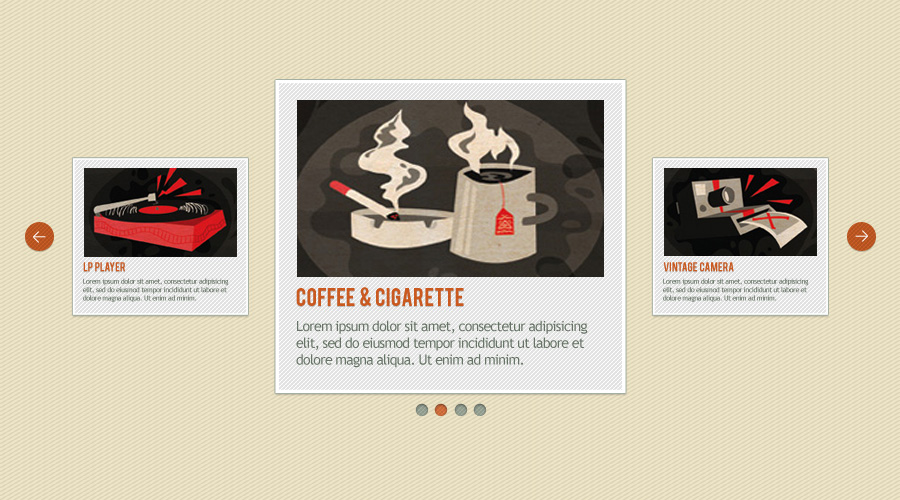
Slideshows and Carousels are suitable only if you are seeking to feature a lot of information on a single page. But, it is not exactly what the audience would prefer. We have written a full article about why you should avoid sliders but heres a quick summary. Most of the visitors might not stay long enough to harness all the details you have given on the page.
It is important to notice that the images and titles are not related to the message that attracted them to the page, the visitors might get frustrated. To combat this and provide your visitors with a good user experience, choose to opt out slideshows.
When you are looking to get the attention of someone, it is important to deliver whatever you promised and remove content that is not relevant.
2. Simplify your navigation

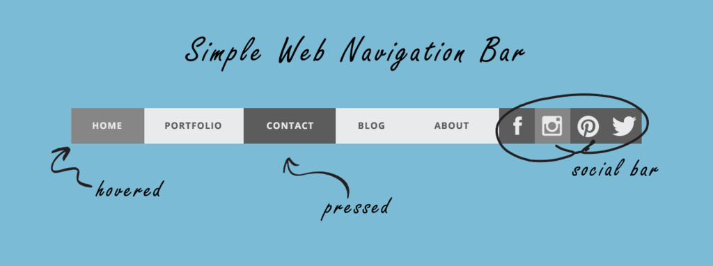
A complex website might seem appealing and catchy at first sight, but it will not be very welcoming for a random visitor to deal with. Infusing a lot of options can be counter-productive as well.
It will only overwhelm the visitor with complexity, instead of simplifying the visitor’s experience. Losing time in an attempt to find what he/she needs is the last thing a user will want.
Do not crowd your header with too many unnecessary links.
3. Use a sketchbook

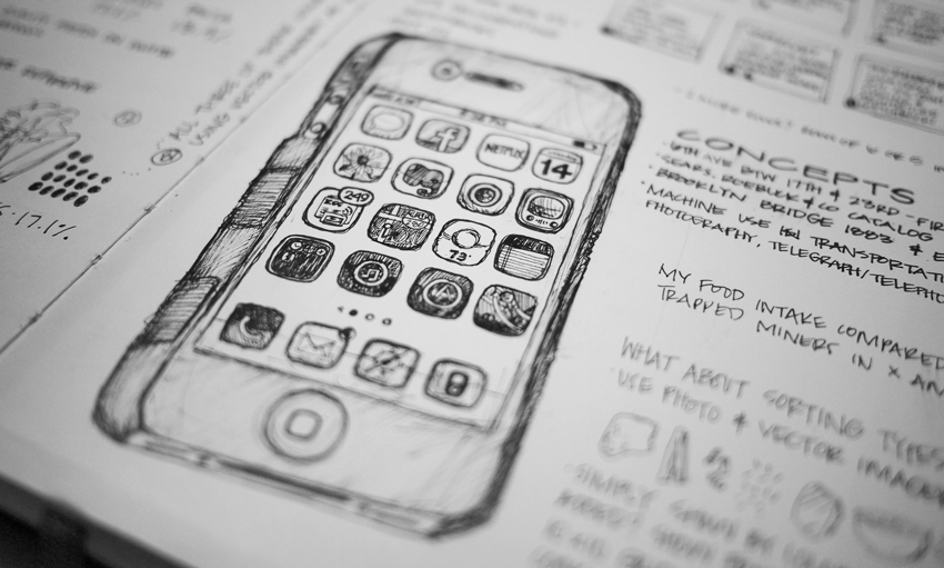
This old-school hack is a must in the list of a designer’s needs. When you get ideas or feel the need of organising a concept, grab your book and sketch it out as the inspiration flows.
Tablets can also help you in drawing your design thoughts, but the feeling of sketching out a design on the paper is irreplaceable. This method can assist you during the brainstorming stages, and your overall design process will be more organised.
4. Try the squint test
All that time in front of your computer can harm your vision. Well, it’s time to put that to good use. Step away from the computer screen and look at your design with your eyes partially closed.
You will get a blurred vision.
It is a result of your eyes reacting to strong light. When you squint a few times, only the prominent aspects of the design will be clearly visible to you.
This can give you clarity about the focal points and what the users will see as soon as they enter your website. This can help you double-check whether the important things in your design stand out.
5. Black, white and grey should be your starting point
Starting with shades of grey is a tip web designing experts recommend. You can gradually move to colours. This is because it helps you create a website that can make the user focus on the crucial aspects of your site.
It can also prevent you from over-designing the page and the elements in prominence will be the ones that need it.
Bonus Tips
- You can use create mood boards on Pinterest for your concept material, sample websites, patterns, layouts, colours, and images. Another advantage is that other web designers would have shared their mood boards on the platform. In short, Pinterest can be a warehouse of resources for designing your website.
- If you want to create a quick rudimentary prototype of your page, use Word or Pages. This will simplify the process and increase productivity when to compare to using design-centric applications like Photoshop for the same purpose.
- A significant chunk of traffic come from mobile websites. So, make sure that your website design is compatible and responsive with mobile devices.
- You need not fill every blank space with your design. Using the white space effectively can give the user a better experience. Do give the elements in your design ample room to breathe.
- Sideboards might decrease the attention of users towards the essential elements on the website. So, include the sidebar in your design only if necessary.
Adhering to the tips listed above can help you create a fantastic website. Do not forget to keep potential users in mind while designing the website.
This will ensure that you are on the right track. You can choose the help of analytics tools to know the preferences and likes of your audience.


