 Tri Theme
Web3 © 2024
Thank you for using the Tri WordPress theme by Web3 Brisbane - Web3's superior WordPress theme framework.
Tri Theme Documentation © 2024 Web3 Pty Ltd. Founded: 22/08/2012

Tri theme layout can be customised in the WordPress customiser:
Divided into the following sections:
Header, Blog, Footer and WooCommerce
Built in metaboxes allow you to modify single post type layouts.
Action functions allow you to add additional content into certain areas of the site.
If you cant add content via actions, simply copy the corresponding theme template file to the child theme to make modifications.
All of the most commonly updated styles can be modified via SCSS variables in the child themes styles.scss. Style variables aim to match what is used in Bootstrap 5.
Tri theme has a post/page metabox to modify pages in the right sidebar.
Sidebar - Choose the sidebar to display or hide. If the default option is set, it will use whatever is set in the theme customiser options.
Header - Choose different header display options
The Layout & Display metabox only displays on the post and page post type. If you want other post types then you can add them to this function:
// Add the Layout & Display Metabox to a custom post type
function tri_additional_metabox_posts() {
	return array('portfolio'); // Add your custom post type slug to the array
}
add_filter( 'tri_add_layout_meta_field', 'tri_additional_metabox_posts' );The advanced custom fields plugin can be used to add additional fields to the metabox.
Tri theme has actions throughout the theme that allow you to execute code functions in specific parts.
You use actions to include code in a specific part of the theme without needing to modify theme files.
Put the code function in your child themes functions.php. Read more about actions here.
function my_new_function() {
	echo 'Hello World!';
}
add_action( 'tri_header_before', 'my_new_function' );| Header - header.php | |
|---|---|
| wp_body_open | At the very beginning of the page document just after the opening <body> tag. |
| Nav Underneath - template-parts/header/nav-underneath.php | |
|---|---|
| tri_nav_content_area | If you are using the header with navigation underneath option, this is the section to the right of the logo just before the widget area |
| Sidebar - sidebar.php | |
|---|---|
| tri_sidebar_before | In the sidebar before any of the main content area of sidebar |
| tri_sidebar_inside_before | In sidebar in main content area of sidebar before any of the content |
| tri_sidebar_inside_after | In sidebar in main content area of sidebar after all of the content |
| tri_sidebar_after | In the sidebar after the main content area of sidebar |
| Page - template-parts/content-page.php | |
|---|---|
| tri_end_of_page | Inside the pages content area at the very end |
| Post - template-parts/content.php | |
|---|---|
| tri_end_of_post | Inside the posts main content area at the very end |
| Footer - footer.php | |
|---|---|
| tri_footer_before | Directly above the <footer> section after the main content. |
| tri_footer_inner_before | Directly after the <footer> section before the footer widgets content. |
| tri_subfooter_before | Just after the widgets section and before the subfooter. |
| tri_subfooter_left | In the left subfooter column just before the menu. |
| tri_subfooter_right | In the right subfooter column just after the copyright text. |
| tri_subfooter_after | In th footer just after the subfooter (outside the container). |
Rows works in conjunction with columns. To be able to use the columns, you need to wrap a row around each line of columns. You can manipulate the layout of the columns by adding in different classes.
| no-gutters | Removes padding from the rows immediate child columns. |
| full-height | Makes the height the size of the screen height. |
| top middle bottom | Vertical alignment of the inner columns. (Applies to all device widths). |
| top-md middle-md bottom-md | (Overrides for tablet & desktop width). |
| top-lg middle-lg bottom-lg | (Overrides for desktop width). |
| around between | If the inner columns combined length does not make up the full width of the container, this will allow the columns to be distributed evenly with spacing either on the inner or outer side of the column. (Applies to all device widths). |
| around-md between-md | (Overrides for tablet & desktop width). |
| around-lg between-lg | (Overrides for desktop width). |
| animate | View Animation Options. |
<div class="row">
	<!-- Div columns here -->
</div>The Tri theme has been built on a 12 column responsive grid system. Columns form the base for all page and post layouts. Each column is evenly spaced and is locked in a fixed width container based upon the device width being viewed on. A full width row adds up to 12
Available grid sizes are: auto, 1, 2 (sixth), fifth, 3 (quarter), 4 (third), 5, 6 (half), 7, 8 (two-third), 9, 10, 11, 12 (full)
Using auto will automatically determine even spacing based on how many columns are in the row. It will try and space each column on one line.
Columns must be wrapped by a row.
| col-1 col-2 col-fifth col-3 col-4 col-5 col-6 col-7 col-8 col-9 col-10 col-11 col-12 | The width of the column out of 12. (Applies to all device widths). |
| col-md-1 col-md-2 col-md-fifth col-md-3 col-md-4 col-md-5 col-md-6 col-md-7 col-md-8 col-md-9 col-md-10 col-md-11 col-md-12 | (Overrides for tablet & desktop width). |
| col-lg-1 col-lg-2 col-lg-fifth col-lg-3 col-lg-4 col-lg-5 col-lg-6 col-lg-7 col-lg-8 col-lg-9 col-lg-10 col-lg-11 col-lg-12 | (Overrides for desktop width). |
| offset-1 offset-2 offset-fifth offset-3 offset-4 offset-5 offset-6 offset-7 offset-8 offset-9 offset-10 offset-11 offset-12 | Pushes the column to the right by x amount of columns. |
| offset-md-1 offset-md-2 offset-md-fifth offset-md-3 offset-md-4 offset-md-5 offset-md-6 offset-md-7 offset-md-8 offset-md-9 offset-md-10 offset-md-11 offset-md-12 | (Overrides for tablet & desktop width). |
| offset-lg-1 offset-lg-2 offset-lg-fifth offset-lg-3 offset-lg-4 offset-lg-5 offset-lg-6 offset-lg-7 offset-lg-8 offset-lg-9 offset-lg-10 offset-lg-11 offset-lg-12 | (Overrides for desktop width). |
| animate | View Animation Options. |
<div class="col-12 col-md-6">Content</div>Create an accordion text toggle box. Has two parts, the title and the body.
| is-active | Make the accordion body show by default on load. Apply to "accord-body" div. |
| animate | View Animation Options. |
<div class="tri-accord mb-3">
	<div class="accord-title font-weight-bold">
		<?php tri_icon( 'add_circle_outline', 'sm mr-2 mr-sm-2' ); ?> Title
	</div>
	<div class="accord-body">Body</div>
</div>Add an SVG icon to the page that is wrapped in a <i> tag.
The tri_icon( $name, $classes, $type ) function accepts 3 arguments.
Parameter 1 - Icon name. (string)
| favourite | The name of the icon. See full list of available Icons here. |
Parameter 2 - CSS Classes. (string)
| sm lg xl xxl | Decreases/Increases the size of the icon. |
| highlight-color | Sets the icon to have the highlight color of the site. |
| circle | makes the icon have a circle border around it. |
| animate | View Animation Options. |
Parameter 3 - Icon Type. (string)
| material social-icons custom | Allows you to choose from different sets of icons or set your own custom icon (See below). |
<!-- Echo the SVG icon wrapped in <i> tag -->
<?php tri_icon( 'ac_unit', 'lg' ); ?><!-- Echo the SVG icon wrapped in <i> tag -->
<?php tri_icon( get_field('icon'), 'lg' ); ?>You can also use these helper functions to display the svg icons.
<!-- Get the SVG icon wrapped in <i> tag -->
<?php tri_get_icon( 'ac_unit', 'lg', 'material' ); ?>

<!-- Echo just the SVG icon. (Doesnt accept CSS classes) -->
<?php tri_svg( 'ac_unit', 'material' ); ?>

<!-- Get just the SVG icon.  (Doesnt accept CSS classes) -->
<?php tri_get_svg( 'ac_unit', 'material' ); ?>
View Icons demo on Tri theme site →
You can add your own custom SVG icons via the child theme. Add your SVG's into a folder in the 'assets/img' folder in your child themes root. You will need to add the third parameter to the icon function.
Your custom icons folder structure should look like this:
*tri-child theme* /assets/img/custom-iconIf you want to put your icons into a sub-folder inside the custom folder, you can, you just need to add that folder name before the icon name followed by a forward slash / in the icon parameter.
iconset/my-iconA tab container to place individual tab information into. Add single tab information into each tab.
| is-horizontal is-vertical | Makes the tabs either horizontal or vertical tabs. |
| animate | View Animation Options. |
<div class="tabs is-horizontal" role="tablist">
	<div class="tabs-nav">
		<a href="#tab-1" role="tab" aria-controls="tab-1" class="is-active">Tab Title 1</a>
		<a href="#tab-2" role="tab" aria-controls="tab-2">Tab Title 2</a>
	</div>
	<div class="tab-content">
		<div id="tab-1" class="tab-pane is-active" role="tabpanel">Tab Content 1</div>
		<div id="tab-2" class="tab-pane" role="tabpanel">Tab Content 2</div>
	</div>
</div><?php // ACF: Repeater field. title, content subfields
if( have_rows('tabs') ): $i = 1;
$all_tabs = array();
while( have_rows('tabs') ): the_row();
$all_tabs[$i]['title'] = get_sub_field('title');
$all_tabs[$i]['content'] = get_sub_field('content');
$i++;
endwhile; ?>
<div class="tabs is-horizontal" role="tablist">
<div class="tabs-nav">
<?php foreach ($all_tabs as $key => $tab): ?>
<a href="#tab-<?php echo $key; ?>" role="tab" aria-controls="tab-<?php echo $key; ?>" class="<?php ($key == 1 ? 'is-active' : ''); ?>">
<?php echo ( $tab['title'] ? esc_html( $tab['title'] ) : '' ); ?>
</a>
<?php endforeach ?>
</div>
<div class="tab-content">
<?php foreach ($all_tabs as $key => $tab): ?>
<div id="tab-<?php echo $key; ?>" class="tab-pane <?php ($key == 1 ? 'is-active' : ''); ?>" role="tabpanel">
<?php echo ( $tab['content'] ? esc_html( $tab['content'] ) : '' ); ?>
</div>
<?php endforeach ?>
</div>
</div>
<?php endif; ?>Makes a number count up from zero or down to a specified number.
<!-- PHP Shorthand Version -->
<?php tri_count_up( $number, $title, $duration ); ?>


<!-- HTML Version -->
<div class="tri-count-up text-center text-sm-center">
	<div class="count-number show-on-scroll" data-number="10" data-duration="3">
		<span class="invisible">0</span>
	</div>
	<div class="count-title text-uppercase">Title</div>
</div><!-- PHP Shorthand Version -->
<?php tri_count_up( get_field('number'), get_field('title'), get_field('button') ); ?>
<!-- HTML Version -->
<div class="tri-count-up text-center text-sm-center">
<div class="count-number show-on-scroll" data-number="10" data-duration="3">
<span class="invisible">0</span>
</div>
<div class="count-title text-uppercase">Title</div>
</div>Use this shortcode to create styled testimonials.
| 120 | An images ID uploaded to the media folder. |
| thumbnail medium medium_large large full | The size of the image. |
| none left center right | The alignment of the image. |
| Joe Bloggs | The name of the person who is being quoted. |
| General Manager | The role/position of the person who is being quoted. |
| over under | Position the content either abover or below the testimonial name and position. |
| animate | View Animation Options. |
Tri uses the default posts list block to display recent posts. Read about how to administer the post list block here.
Embeds a popup on the page. The popup has two parts. The anchor that triggers the popup and the hidden content that gets displayed in the popup when the popup is triggered.
Trigger the popup by any anchor or button by adding the is-popup-link class to it.
<a href="#my-popup" class="is-popup-link">Open Popup</a>

<div id="my-popup" class="tri-popup mfp-hide">
	<!-- My Popup Content -->
</div><?php $link = get_field('link');
if( $link ): ?>
<a href="<?php echo esc_url( $link['url'] ); ?>" class="is-popup-link"><?php echo esc_html( $link['title'] ); ?></a>
<?php endif; ?>
<div id="<?php echo esc_url( ltrim( $link['url'], '#' ) ); ?>" class="tri-popup mfp-hide">
<?php the_field('content'); ?>
</div>The code is slightly different for external content such as YouTube videos. Use the is-popup-media class on the anchor and add the content URL as the href. No hidden div with the content is necessary.
<a href="http://www.youtube.com/watch?v=dQw4w9WgXcQ" class="is-popup-media">Open Video Popup</a><?php $link = get_field('link');
if( $link ): ?>
<a href="<?php echo esc_url( $link['url'] ); ?>" class="is-popup-media"><?php echo esc_html( $link['title'] ); ?></a>
<?php endif; ?>Tip: You can place the hidden popup content anywhere on the page and trigger it by any anchor link or button using the same anchor of the id you assigned to the popup.
Note: If you are using another anchor link then you need to ensure it has the class "is-popup-link" (for inline content) or "is-popup-media" (for youtube, vimeo or google maps links) to trigger the popup.
Converts an email address into a character encoded email address that helps prevent spam when using your email address on a page. It also includes an item property to indicate better visibility to search engines
<?php $email = 'email@example.com'; ?>

<!-- PHP Shorthand Version -->
<?php tri_antispam_email( $email ); ?>


<!-- HTML Version -->
<?php if ( is_email( $email ) ) : ?>
	<a class="tri-email" itemprop="email" href="mailto:<?php echo antispambot( trim( $email ) ); ?>">
		<?php echo antispambot( esc_html( $email ) ); ?>
	</a>
<?php endif; ?><?php tri_antispam_email( get_field('email') ); ?>Converts a phone number into a click-to-call phone number so users can easily contact you. It also includes an item property to indicate better visibility to search engines.
<!-- PHP Shorthand Version -->
<?php tri_phone( '0123 456 789' ); ?>


<!-- HTML Version -->
<a class="tri-phone" itemprop="telephone" href="tel:0123456789">0123 456 789</a><!-- PHP Shorthand Version -->
<?php tri_phone( get_field('phone') ); ?>
<!-- HTML Version -->
<a class="tri-phone" itemprop="telephone" href="tel:<?php echo esc_attr( preg_replace('/\s+/', '', get_field('phone') ) ); ?>">
<?php echo esc_html( get_field('phone') ); ?>
</a>Tri theme has a few widgets inbuilt that add additional features. You can add these widgets the same way as any other widget in the Appearance > Widgets page.

The Tri Contact Information widget allows you to quickly and easily set your contact details. Fill in each field to display the corresponding information accompanied with an icon.

The widget automatically converts the phone numbers to a click-to-call and the email to an encoded (antispam) email tap-to-email link.
Tri theme has a number of ready made CSS classes to make designing and layout consistent and simpler.
Essentially, ready made classes are class names that you can add to an element to take advantage of pre-defined styles included in the Tri theme. They are mostly based off bootstrap utility classes
| rounded-circle rounded-pill rounded-0 | Change the border radius. |
Note: to make an element completely circle, it needs to have the same width and height otherwise it will be turned into an oval shape.
You can add margin and padding space to an element by using one of the following spacing classes. The class sizes are multiples of a base number. By default the number is 1rem (16px) represented as $spacer.
| m-0 m-1 m-2 m-3 m-4 m-5 | (desktop). |
| m-sm-0 m-sm-1 m-sm-2 m-sm-3 m-sm-4 m-sm-5 | (mobile). |
| p-0 p-1 p-2 p-3 p-4 p-5 | (desktop). |
| p-sm-0 p-sm-1 p-sm-2 p-sm-3 p-sm-4 p-sm-5 | (mobile). |
| mt-0 mt-1 mt-2 mt-3 mt-4 mt-5 | (desktop). |
| mt-sm-0 mt-sm-1 mt-sm-2 mt-sm-3 mt-sm-4 mt-sm-5 | (mobile). |
| pt-0 pt-1 pt-2 pt-3 pt-4 pt-5 | (desktop). |
| pt-sm-0 pt-sm-1 pt-sm-2 pt-sm-3 pt-sm-4 pt-sm-5 | (mobile). |
| me-0 me-1 me-2 me-3 me-4 me-5 | (desktop). |
| me-sm-0 me-sm-1 me-sm-2 me-sm-3 me-sm-4 me-sm-5 | (mobile). |
| pe-0 pe-1 pe-2 pe-3 pe-4 pe-5 | (desktop). |
| pe-sm-0 pe-sm-1 pe-sm-2 pe-sm-3 pe-sm-4 pe-sm-5 | (mobile). |
| mb-0 mb-1 mb-2 mb-3 mb-4 mb-5 | (desktop). |
| mb-sm-0 mb-sm-1 mb-sm-2 mb-sm-3 mb-sm-4 mb-sm-5 | (mobile). |
| pb-0 pb-1 pb-2 pb-3 pb-4 pb-5 | (desktop). |
| pb-sm-0 pb-sm-1 pb-sm-2 pb-sm-3 pb-sm-4 pb-sm-5 | (mobile). |
| ms-0 ms-1 ms-2 ms-3 ms-4 ms-5 | (desktop). |
| ms-sm-0 ms-sm-1 ms-sm-2 ms-sm-3 ms-sm-4 ms-sm-5 | (mobile). |
| ps-0 ps-1 ps-2 ps-3 ps-4 ps-5 | (desktop). |
| ps-sm-0 ps-sm-1 ps-sm-2 ps-sm-3 ps-sm-4 ps-sm-5 | (mobile). |
| has-text-align-left has-text-align-center has-text-align-right | Aligns text element using built in gutenberg styles (all devices). |
| has-text-sm-align-left has-text-sm-align-center has-text-sm-align-right | Overrides text alignment for mobile. |
| d-block d-none | Display or hide an element. |
| d-sm-none | Hide an element (mobile only). |
| d-md-none | Hide an element (desktop only). |
| visually-hidden | Hides text but keeps it visible for screen readers. |
Add class to the <ul>
| list-unstyled | Makes the list items have no bullet points and padding. |
| list-inline | Makes the list items inline (horizontal list) and unstyled. |
Various CSS classes to manipulate text
| h1 h2 h3 h4 h5 h6 | Make text look like any heading size. |
| text-uppercase | Make the text uppercase. |
| font-italic | Make the text italic. |
| font-weight-light font-weight-normal font-weight-bold | Change the weight of the font. |
| text-2-col text-3-col | Makes the text formatted into multiple columns on desktop. |
| has-pale-pink-color has-vivid-red-color has-luminous-vivid-orange-color has-luminous-vivid-amber-color has-light-green-cyan-color has-vivid-green-cyan-color has-pale-cyan-blue-color has-vivid-cyan-blue-color has-vivid-purple-color has-white-color has-very-light-gray-color has-cyan-bluish-gray-color has-very-dark-gray-color | Change the colour of the text. |
| has-pale-pink-background-color has-vivid-red-background-color has-luminous-vivid-orange-background-color has-luminous-vivid-amber-background-color has-light-green-cyan-background-color has-vivid-green-cyan-background-color has-pale-cyan-blue-background-color has-vivid-cyan-blue-background-color has-vivid-purple-background-color has-white-background-color has-very-light-gray-background-color has-cyan-bluish-gray-background-color has-very-dark-gray-background-color | Change the colour of the background. |
Animate elements on the screen
You can animate any element on the screen by adding the following 3 classes to it.
| animate | This class must be present to animate the element. |
| show-on-scroll has-animated | Either delay animation until element is visible or animate stratight away. One of these classes must be present to animate the element. |
| flipInX flipInY fadeIn fadeInUp fadeInDown fadeInLeft fadeInRight bounceIn bounceInUp spin | Different animation options. |
Gravity forms has a number of ready made classes here. Tri theme has a number of additional ready made classes to make gravity forms layouts easier.
Apply these classes to the forms CSS Class Name field in the form layout section of each forms Form Settings
| inline-optin-form | Makes an email opt-in form have the submit button inline (horizontal layout). This is finicky and may need some additional adjusting based on what fields are in the form but will work ok with just a name and email field. |
Tri uses SCSS to build its stylesheet. It pulls the parent themes styles from the parent theme through to the child themes stylesheet when the style.scss file is compiled in the child theme.
A number of the parent themes styles are overwriteable through SCSS variables. This gives the benefit of not having to declare new styles in the child theme to overwrite the parent themes styles. You simply update the variable and the theme sets that new value in the right place once it is compiled in scss. This means that the stylesheet is kept as small as possible.
Variables are found in the parent theme at tri/assets/scss/_variables.scss.
To overwrite a variable through the child theme, write/copy the variable you want to overwrite and paste it into the Tri child themes variables section at the top of the style.scss file. Make sure to remove the !default attribute from the end of the variable to make the new variable value take affect.
Tri uses a mobile first approach where mobile styles are loaded first then the styles scale up from there to tablet then desktop. Be aware of the media queries when adding styles. They may work for desktop but mobile might not display nicely.
These are the media query breaks that we use for mobile, tablet and desktop in Tri:
/* #Mobile
 ================================================== */
@media (max-width: 767px) {}

/* #Tablet and Higher
 ================================================== */
@media (min-width: 768px) {}

/* #Desktop
 ================================================== */
@media (min-width: 992px) {}

/* #Large Desktop
 ================================================== */
@media (min-width: 1200px) {}@media only screen and (max-width: 991px){
}You can add smooth anchor scrolling to any anchor link on your page. To do so, simply add the following class "js-scroll" to an anchor link then add the anchor id to an element such as a grid, section or divider. E.G.
<a href="#my-id" class="js-scroll">Scroll to content</a><div id="my-id">My scroll to content</div>If you would like to make the smooth anchor scroll position above or below the anchor, you can offset it above or below. It is the same steps as Smooth anchor scrolling but you add an additional offset attribute below.
<a href="#my-id" data-offset="50" class="js-scroll">Scroll to content</a>The value can be a positive number or a negative number.
Make the number positive (e.g. 20) to offset the scroll above the anchor.
Make the number negative (e.g. -20) to offset the scroll below the anchor.
If you want to scroll to an anchor on the page using a menu item then you can do that by setting the URL to the id of the anchor.
The second step is to add the following class to the menu item.
js-menu-scrollIf you are building a custom page that requires a different logo, this code will allow you to set the custom logo whilst keeping the logo set in theme options as a backup/for other pages.
The code below will set a custom logo URL for the homepage. The image that is set will go into the child themes img folder.
You can adjust the if statement to set the custom logo on specific pages only using Conditional Tags.
/*******************************************************************************
	Set a custom URL for the logo on a particular page
*******************************************************************************/
function tri_set_custom_logo_url( $logo ) {

	// If homepage, set custom logo, otherwise use default logo set in theme options
	if ( is_home() ) {
		return get_template_directory_uri() . '/img/custom-logo.png';
	} else {
		return $logo; // the $logo parameter is the URL from tri_brand_logo() function
	}
}
add_filter('tri_custom_logo_url', 'tri_set_custom_logo_url');If you are building a custom page that requires a different menu, this code will allow you to add items to the menu on a specific page whilst keeping the menu as is across other pages.
You can adjust the if statement to set the menu items to only show on specific pages using Conditional Tags.
This code adds items to the end of the menu
/*******************************************************************************
	Append custom menu items to main menu
*******************************************************************************/
function tri_custom_menu_item ( $items, $args ) {
	// Adds a custom menu item to the main menu on homepage only
	if ( $args->theme_location == 'main_nav' && is_home() ) {
		$items .= '<li class="menu-item"><a href="#">Menu</a></li>';
	}
	return $items;
}
add_filter( 'wp_nav_menu_items', 'tri_custom_menu_item', 10, 2 );/*******************************************************************************
Overwrite menu with custom items in main menu
*******************************************************************************/
function tri_custom_menu_item ( $items, $args ) {
// Adds a custom menu item to the main menu on homepage only
if ( $args->theme_location == 'main_nav' && is_home() ) {
$items = '<li class="menu-item"><a href="#">Menu</a></li>';
}
return $items;
}
add_filter( 'wp_nav_menu_items', 'tri_custom_menu_item', 10, 2 );There are a number of plugins that are built for Tri. They are features that are not always used so they are added as their own plugin to keep Tri lightweight.
Tri MegaMenu plugin adds the ability to make slightly more advanced menu layouts using the built in menu classes option.

The Tri MegaMenu uses the default WordPress menu to layout the menu items. It uses the built in "CSS Classes" option to add the styling. CSS Classes is not enabled by default but can be activated by the "Screen Options" dropdown on the menu page.

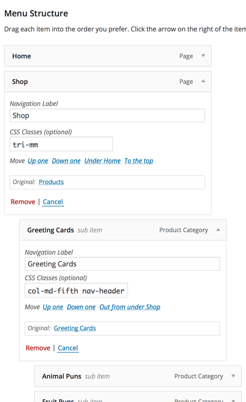
As demonstrated in the image above, the MegaMenu has 4 classes available and can use the built in column classes to achieve the desired layout. You can compare the two previous images to see where to put each class in the column. The Menu Structure image below might also help you understand where to put the classes.
| tri-mm | Activates the megamenu for the current menu item and all of its descendant menu items. |
| nav-header | Makes the menu item stand out so it is bolded and has an underline. |
| nav-footer | Makes the menu item stand out so it is emphasised but less so than the header. |
To add in columns, you can use the columns built in. Make sure you think about how the layout needs to be on all screen sizes.
The megamenu is automatically positioned in the center. If you would like to position the menu to the left or the right of the page then you can add the following classes next to the tri-mm menu class.
| tri-mm-right tri-mm-left | Position the menu to either side of the page. |

Tri uses the default social icons widget. Read about how to customise it here